Xendurance
Supplementsxendurance.com
Solid
out of 100
Summary
Xendurance Blood Fuel is a well-structured product page with strong clarity — the product name, value proposition, and three-tier pricing are all above the fold on mobile, and 305 reviews at 4.88 stars are prominently placed. The page's biggest strength is its purchase option architecture (subscribe/member/one-time) which surfaces subscription value clearly. The two critical gaps are a missing sticky CTA on mobile (the button scrolls away during the long benefits section) and a 14-second LCP that will cause significant cold-visitor drop-off before the page even loads.
AI-Shoppable
100 / 100 · StrongProduct structured data is present and AI crawlers are allowed. 0 of 11 signals still missing.
Top Fixes
- 1
Implement a sticky 'ADD TO CART | $44.06' bottom bar on mobile so the CTA is always one thumb-tap away as users scroll through benefits, accordions, and the pairing section — this is the single highest-leverage conversion fix.
- 2
Add inline photo/UGC reviews near the product title or just below the CTA — even 3–4 customer action photos showing real athletes using Blood Fuel will dramatically increase trust without requiring a scroll to a review section.
- 3
Resolve the 14-second LCP by lazy-loading below-fold images, compressing the hero product image, and deferring non-critical scripts — a cold mobile visitor losing 14 seconds on load is losing the sale before the page even renders.
Findings
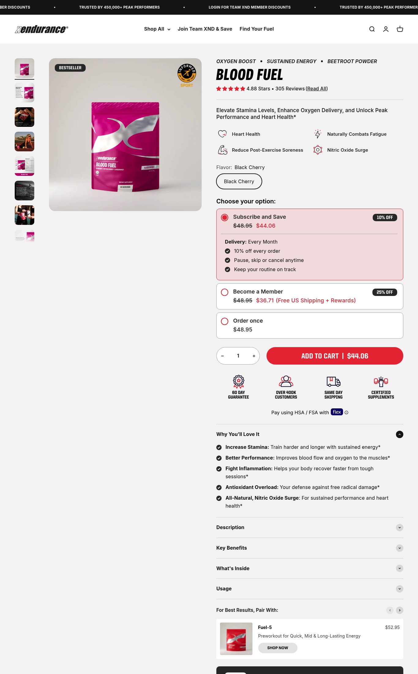
The 'ADD TO CART | $44.06' button is large, red, and prominent on mobile. A sticky CTA bar does not appear to be present — the button is inline within the page and would scroll out of view as the user reads the 'Why You'll Love It' section and accordions below. No sticky bottom bar is visible in the mobile screenshot.
purchase friction · high
PSI mobile score is 59/100 with LCP of 14.0 seconds and FCP of 5.8 seconds. An LCP of 14 seconds is severely above the 2.5s good threshold and means a cold mobile visitor on an average connection will stare at a blank or partially loaded page for over 10 seconds before the hero image renders. This directly kills first impressions and likely inflates bounce rate.
mobile performance · critical
No customer photo reviews or UGC are visible on the page in either screenshot. The review section is collapsed behind a 'Read All' link and no photo thumbnails appear inline near the product. In the supplements vertical, photo reviews showing real athletes using the product are a top trust signal.
social proof · high
Desktop thumbnail rail shows 7+ images including lifestyle shots (athletes in action, product in use) and a flat-lay. On mobile the carousel dots indicate multiple images. However, no video content is visible anywhere on the page — no autoplay loop, no embedded video, no video thumbnail. In the supplements category, video demonstrating use or results is a strong conversion driver and its absence is a meaningful gap.
visual merch · high
Three purchase options (Subscribe and Save 10% off, Become a Member 25% off + Free Shipping, Order once) are clearly laid out with radio buttons and pricing. The subscribe option is pre-selected. However, the three-tier pricing structure may create decision paralysis — the difference between 'Subscribe and Save' and 'Become a Member' is not immediately obvious without reading the fine print.
purchase friction · medium
No press mentions or 'As Seen In' bar is visible. The trust badges shown ('60 Day Guarantee', 'Over 400K Customers', 'Same Day Shipping', 'Certified Supplements') are brand-generated claims, not third-party press logos. The 'Informed Sport' certification badge on the product image is a real third-party signal but it is small and embedded in the hero image rather than called out as a named trust bar.
social proof · medium
Shipping clarity is partial: 'Same Day Shipping' badge is visible but no free shipping threshold or estimated delivery date is shown on the page. Free shipping is only mentioned as a perk of the 'Become a Member' tier ($36.71), not as a standalone guarantee for standard orders.
purchase friction · medium
Mobile hero image is full-width and swipe-friendly with dot pagination visible. The product shot is clean with the 'Informed Sport' certification badge overlaid. Lifestyle images (athletes) are present in the desktop thumbnail rail but it is unclear how prominently they appear in the mobile carousel order — the first visible mobile image is a studio product shot, not a lifestyle image.
visual merch · medium
Product name 'BLOOD FUEL' is bold and visible above the fold on mobile, price ($44.06 subscribe / $48.95 one-time) is shown in the purchase option selector, and the hero value prop 'Elevate Stamina Levels, Enhance Oxygen Delivery, and Unlock Peak Performance and Heart Health*' is readable without scrolling. Target customer (endurance athletes, peak performers) is implied by the benefit icons and the marquee copy 'TRUSTED BY 450,000+ PEAK PERFORMERS'. CTA reads 'ADD TO CART | $44.06' — price-in-button is a strong specific signal, earning near-full marks. Minor deduction: the asterisk disclaimer on the value prop headline slightly undermines confidence.
clarity · low
Star rating (4.88 Stars) and review count (305 Reviews) with a 'Read All' link are displayed directly below the product name, well above the fold on mobile. 305 reviews earns 3 pts for volume (100–999 range). This is a clear strength.
social proof · low
Want this done for your brand?
We score your product page from the outside, cold, on mobile, no install.
Request a teardown →