Tuck and Bundle
Baby & Kidstuckandbundleshop.com
Average
out of 100
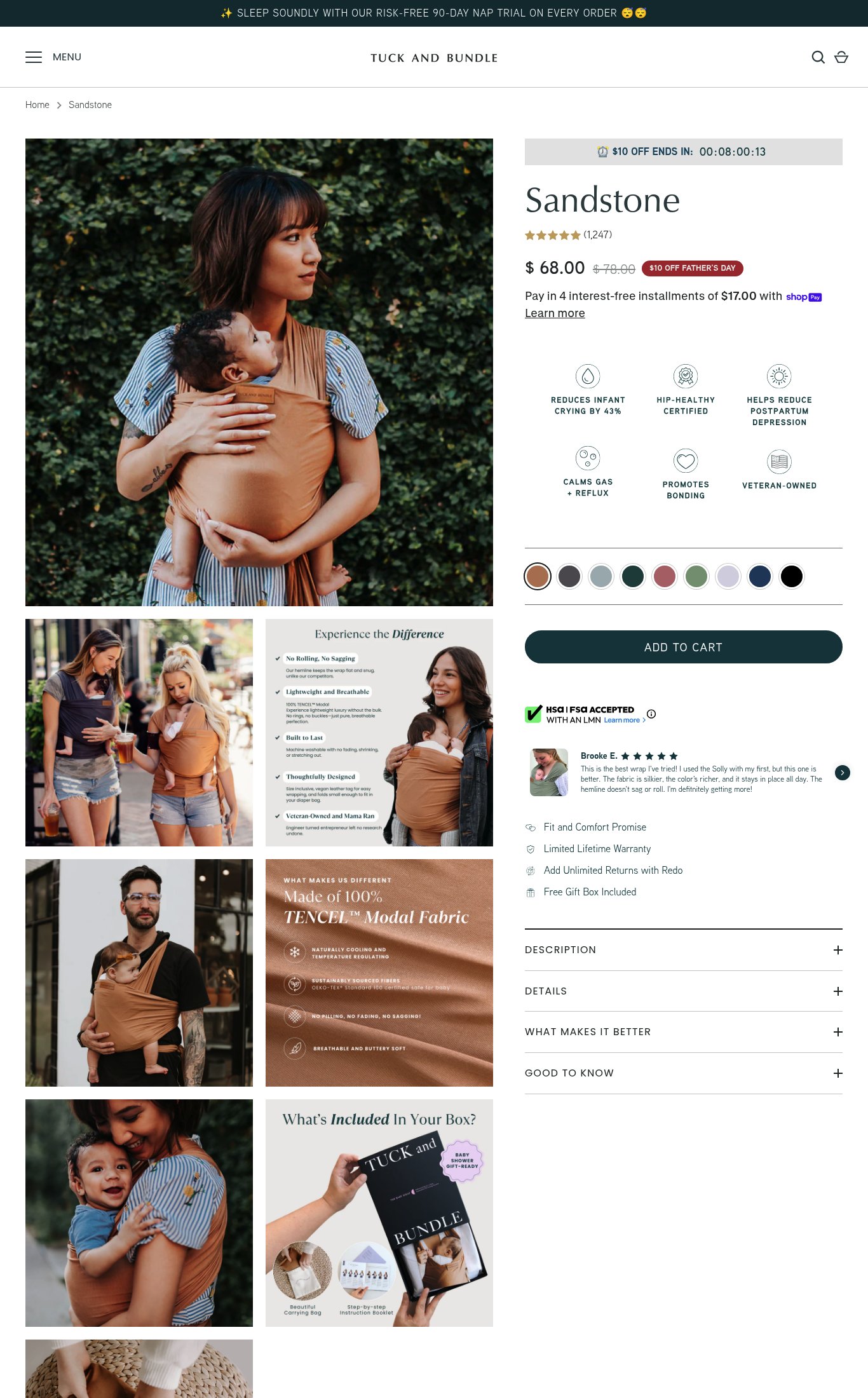
Tuck and Bundle's Sandstone page has a genuinely strong foundation: 1,247 reviews above the fold, rich lifestyle imagery, clear pricing with urgency, and compelling benefit icons. The brand's strongest dimension is visual merchandising, with diverse real-world lifestyle shots and infographic panels. The single most critical gap is mobile performance — an LCP of 18.5 seconds means the majority of cold mobile visitors will never see any of those strengths, and the missing sticky CTA means those who do scroll lose the purchase button entirely.
Top Finding
The 'ADD TO CART' button is large, dark teal, and dominant on mobile. However, it does not appear to be a sticky/persistent button on scroll — once the user scrolls past the CTA section into the accordion descriptions, there is no floating button visible in the mobile screenshot. This means the CTA disappears during content browsing.
purchase friction · high
+8 more findings in the full teardown
Get the full teardown
Score breakdown across all 5 dimensions, every finding, prioritized fix list, and category benchmark position.