TRUFF
Food & Beverageshop.truff.com
Solid
out of 100
Summary
TRUFF's product page is a solid foundation with strong brand aesthetics, excellent review volume placement, and a smart bundle quantity selector — but it punches below its weight for a brand with this much cultural cachet. The page's biggest gap is the complete absence of press mentions and photo reviews, which are TRUFF's most powerful trust signals and are nowhere to be found. The missing sticky CTA on mobile is the single most critical conversion leak given the page's length.
AI-Shoppable
100 / 100 · StrongProduct structured data is present and AI crawlers are allowed. 0 of 11 signals still missing.
Top Fixes
- 1
Add a sticky 'ADD TO CART' bar on mobile scroll — the page is long (video, use cases, description) and the CTA disappears after the first screen, costing conversions from engaged scrollers.
- 2
Surface press credentials ('As seen in Oprah's Favorite Things', Forbes, etc.) and photo reviews near the CTA — TRUFF has earned significant press but none of it appears on this page, leaving a massive trust signal unused for cold visitors.
- 3
Add a hero value proposition line above the fold on mobile — something like 'Black Truffle. Real Heat. Nothing Like It.' between the product name and price to answer 'why this sauce' before the visitor scrolls.
Findings
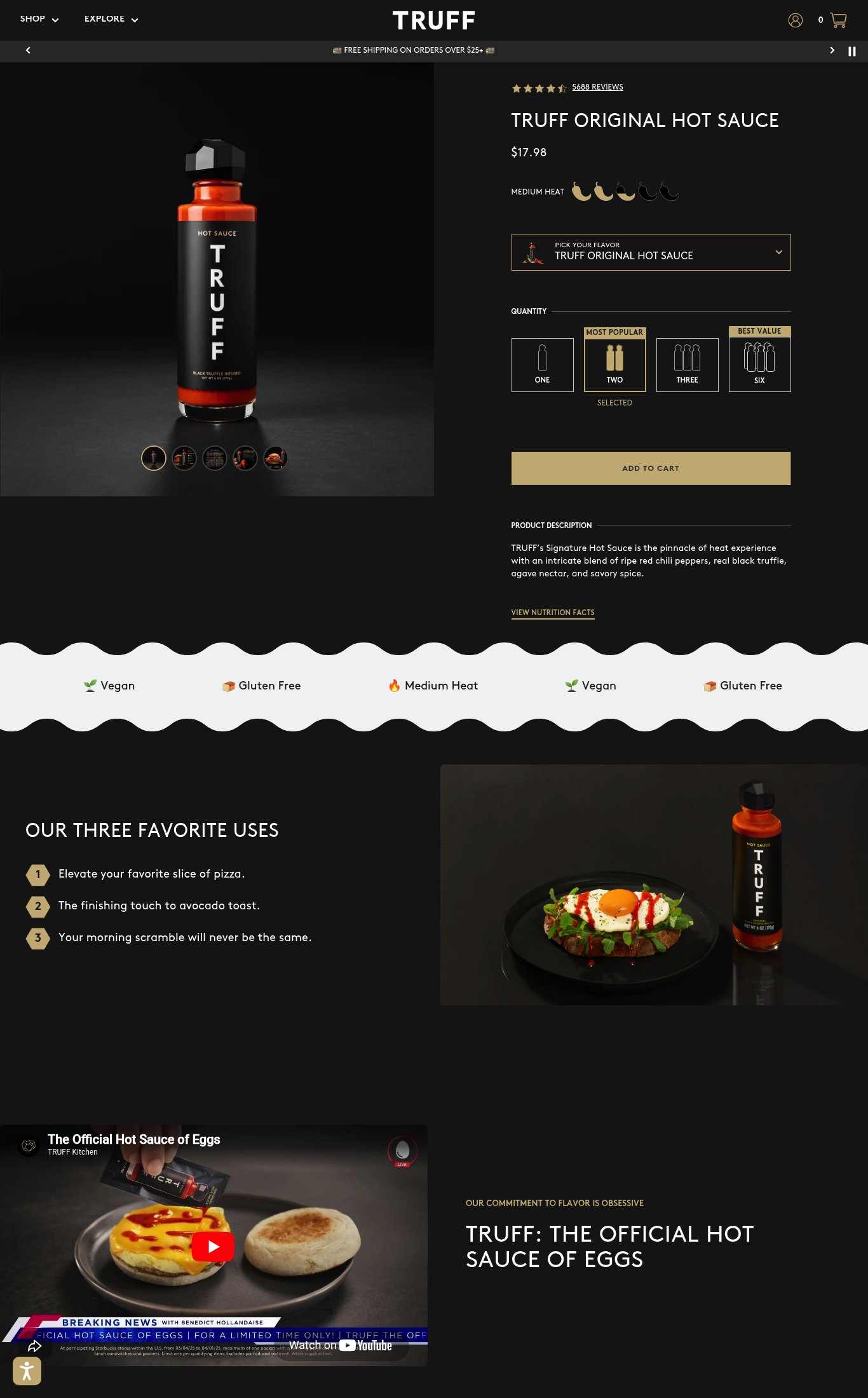
The 'ADD TO CART' button is visible on mobile but does NOT appear to be sticky on scroll — below the CTA the page continues with product description and long content sections, and no persistent sticky bar is visible in the mobile screenshot. A customer scrolling through the 'Three Favorite Uses' or video section has no one-tap path back to purchase.
purchase friction · high
No customer photo reviews or UGC are visible anywhere in the screenshots. The review section is not shown — only the aggregate star/count near the title. No press mentions, 'As Seen In' bar, or named media badges (e.g., Oprah's Favorite Things, Forbes) appear on the page despite TRUFF's well-known press history.
social proof · high
Product name 'TRUFF ORIGINAL HOT SAUCE' and price '$17.98' are both visible above the fold on mobile, but there is no hero headline or value proposition — the product description ('the pinnacle of heat experience with an intricate blend of ripe red chili peppers, real black truffle, agave nectar, and savory spice') is buried below the fold. Nothing above the fold answers 'why this product, why now' beyond the product name itself.
clarity · medium
Desktop thumbnail strip shows 5 images (product on black, lifestyle food shot, and additional angles), earning full image count points. However, on mobile the hero image is a single product-on-black studio shot with small thumbnails below — the lifestyle food imagery (egg dish with sauce) is only visible well below the fold after significant scrolling.
visual merch · medium
A YouTube-embedded video ('The Official Hot Sauce of Eggs') is present on the page, but it is far below the fold on both mobile and desktop — a cold visitor would need to scroll past the product description, attribute bar, and 'Three Favorite Uses' section to reach it. Video is not autoplay or above-the-fold.
visual merch · medium
PSI mobile score is 77/100 with LCP of 4.4s and FCP of 3.2s. The 4.4s LCP is notably slow for a product page — the large hero product image on a dark background is likely the LCP element and is not sufficiently optimized for cold mobile loads.
mobile performance · medium
Free shipping threshold ('FREE SHIPPING ON ORDERS OVER $25+') is shown in the announcement bar at the top — good visibility. However, no delivery estimate or return/money-back guarantee is shown near the CTA. The guarantee/return policy is absent from the product page entirely.
purchase friction · medium
The CTA reads 'ADD TO CART' — baseline generic copy. No specificity like 'Add to Bag', 'Get the Sauce', or 'Try TRUFF' that would reinforce brand voice or urgency.
clarity · low
Star rating (4.5 stars) and '5688 REVIEWS' count are displayed near the product title on both mobile and desktop — this is strong placement and the review volume (1,000+) earns full volume points.
social proof · low
Quantity bundle selector (ONE / TWO / THREE / SIX with 'MOST POPULAR' and 'BEST VALUE' callouts) is a strong upsell mechanic visible above the CTA. No subscribe-and-save toggle or 'frequently bought together' section is visible, leaving subscription revenue on the table.
purchase friction · low
Want this done for your brand?
We score your product page from the outside, cold, on mobile, no install.
Request a teardown →