Tower 28 Beauty
Beautytower28beauty.com
Average
out of 100
Summary
Tower 28 Beauty's Swipe Serum Concealer page is well-structured with strong above-the-fold clarity, an excellent shade selection UX, and 1,000+ reviews surfaced near the product title — social proof volume is the page's clearest strength. The most critical gap is mobile performance: a PSI score of 48 and a 23.1-second LCP means the majority of cold mobile visitors will never see the page at all. Closing the photo review and video content gaps would meaningfully lift conversion for visitors who do make it through.
AI-Shoppable
100 / 100 · StrongProduct structured data is present and AI crawlers are allowed. 0 of 11 signals still missing.
Top Fixes
- 1
Fix mobile page speed urgently — a 23.1s LCP means most cold mobile visitors bounce before seeing the product. Audit and defer non-critical JavaScript, compress hero images, and implement a CDN or lazy-load strategy to get LCP under 4s.
- 2
Add customer photo reviews (UGC) to the product page — for a concealer with 28 shades, shoppers need to see real skin tones and coverage results. A photo review carousel or shoppable UGC grid directly below the CTA would address the single biggest trust gap on the page.
- 3
Introduce a video asset — an autoplay loop showing the serum-like application texture and buildable coverage would do more selling work than any static image. Even a 10-second silent clip in the image carousel would differentiate this page and reduce 'does it actually work?' hesitation.
Findings
PSI mobile score is 48/100 with an LCP of 23.1s and FCP of 5.6s — catastrophically slow cold load. A first-time mobile visitor waits over 23 seconds before the largest content element renders, which will cause significant bounce before the page is even seen.
mobile performance · critical
No customer photo reviews or UGC are visible anywhere in the screenshots — neither in a review carousel nor in a dedicated UGC section. For a beauty concealer where shade match and skin-tone diversity are purchase anxieties, the absence of photo reviews is a meaningful trust gap.
social proof · high
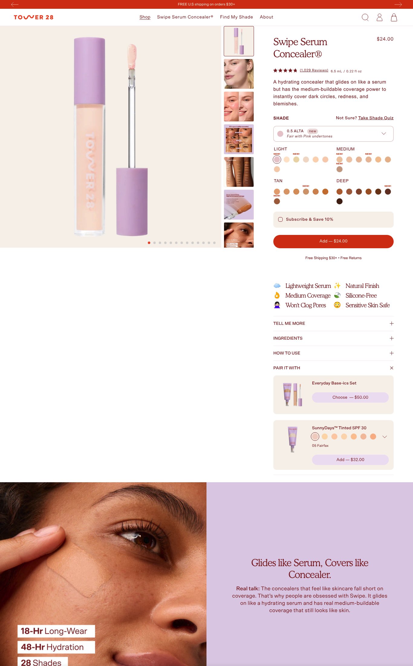
Desktop thumbnail rail shows 7+ images including product-only shots, on-model application close-ups, and shade-range swatches. Mobile carousel dots indicate 10+ images. Image count is strong (5+ = full marks). However, no video content is visible anywhere on the page — no autoplay loop, no embedded tutorial, no video thumbnail — a missed opportunity for a product where application technique matters.
visual merch · high
No press mentions, 'As Seen In' bar, or named certifications (e.g., EWG Verified, Allure Best of Beauty) are visible on the page. The feature icons (Silicone-Free, Sensitive Skin Safe, Won't Clog Pores) are benefit claims, not third-party validation.
social proof · medium
Mobile images appear full-width and swipe-friendly with a dot pagination indicator. The hero image is a clean product shot on a light background; lifestyle/on-skin imagery appears lower in the carousel and below the fold in the editorial section ('Glides like Serum, Covers like Concealer'). Lifestyle imagery exists but is not the lead image.
visual merch · medium
Product name 'Swipe Serum Concealer®' and price '$24.00' are both visible above the fold on mobile alongside a short, specific value prop: 'A hydrating concealer that glides on like a serum but has the medium-buildable coverage power to instantly cover dark circles, redness, and blemishes.' This is strong above-the-fold clarity.
clarity · low
CTA copy reads 'Add — $24.00' which is functional and price-reinforcing but not emotionally specific. It scores above baseline but misses an opportunity for copy like 'Get My Shade' or 'Add to Bag' that matches the shade-selection journey the page is built around.
clarity · low
Star rating (4.5 stars) and review count (1,029 Reviews) are visible directly below the product name on mobile — well above the fold. Review volume of 1,000+ earns full marks. This is the page's strongest trust signal.
social proof · low
The 'Add — $24.00' CTA is a prominent red button visible on mobile and appears to be sticky on scroll based on its placement. 'Free Shipping $30+ • Free Returns' is shown directly beneath the CTA — shipping threshold and return policy are both surfaced near the buy button, which is best practice.
purchase friction · low
Shade selection UX is well-executed: 28 swatches are displayed with a 'Not Sure? Take Shade Quiz' link, the selected shade shows its name and undertone ('0.5 ALTA — Fair with Pink Undertones'), and 'NEW!' badges call out new additions. Out-of-stock state is not visible in the screenshot but the overall variant UX is clear.
purchase friction · low
A 'Subscribe & Save 10%' toggle is present above the CTA, and a 'Pair It With' bundle section shows 'Everyday Base-ics Set — $50.00' and 'SunnyDays™ Tinted SPF 30 — Add $32.00'. Both upsell and subscription options are present, earning full marks for this sub-dimension.
purchase friction · low
Want this done for your brand?
We score your product page from the outside, cold, on mobile, no install.
Request a teardown →