Sonix
Electronicsshopsonix.com
Solid
out of 100
Summary
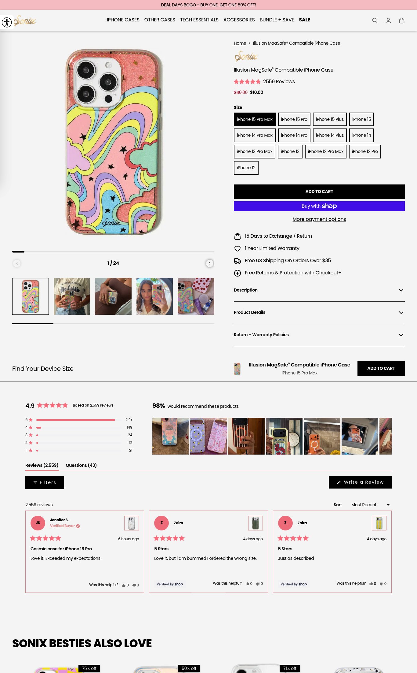
Sonix has a genuinely strong product page foundation: 2,559 reviews at 4.9 stars with photo UGC, a sticky mobile CTA, lifestyle imagery, and clear pricing with a compelling sale discount. Social proof is the page's strongest dimension. The single most critical gap is mobile performance — a PSI score of 36 with an 11.5-second LCP means a significant share of cold mobile visitors bounce before the hero image even loads, undermining every other conversion element on the page.
AI-Shoppable
100 / 100 · StrongProduct structured data is present and AI crawlers are allowed. 0 of 11 signals still missing.
Top Fixes
- 1
Fix mobile page speed immediately — LCP of 11.5s and TBT of 1,260ms will kill conversion before the page even loads. Compress and lazy-load the 24-image gallery, defer non-critical JS, and serve next-gen image formats. This is the single highest-ROI fix on the page.
- 2
Clarify iPhone model compatibility in the variant selector — add iPhone 16 / 16 Pro / 16 Pro Max if supported, mark any out-of-stock models visually, and add a one-line compatibility note ('Fits iPhone 12 through 15 Pro Max') so visitors don't abandon due to confusion.
- 3
Add a hero value proposition beneath the product name — a single line like 'MagSafe-ready. Drop-tested. Designed to turn heads.' answers why this case over any other and gives the page a reason-to-buy beyond the design alone.
Findings
PSI mobile score is 36/100 with LCP of 11.5 seconds and TBT of 1,260 ms. A cold mobile visitor waits over 11 seconds for the largest content element to render — this is a critical abandonment risk, especially for a visually-driven product where the hero image IS the product.
mobile performance · critical
The size variant grid lists 11 iPhone models as text-only pill buttons with no visual indicator of which models are out of stock. A visitor on an iPhone 16 will not find their model listed and may abandon without realizing the case fits iPhone 16 Pro Max (if it does) — the compatibility copy is unclear.
purchase friction · high
No video content is visible anywhere on the product page — no autoplay loop, no embedded video, no video thumbnail. For a visually-driven phone case brand, a short video showing the design, MagSafe click, or drop test would significantly boost conversion.
visual merch · high
Product name 'Illusion MagSafe® Compatible iPhone Case' is visible above the fold on mobile, price shows $10.00 (struck through $40.00), and star rating with '2559 Reviews' appears near the title — all readable without scrolling. However, there is no hero value proposition beyond the product name; nothing answers 'why this case over any other' (no tagline like 'drop-proof', 'ultra-slim', or 'designed for creators').
clarity · medium
No press mentions, 'As Seen In' bar, or named publication badges are visible anywhere on the page. For a brand at this review volume, a press bar (e.g., Teen Vogue, Refinery29) would meaningfully lift trust for cold visitors.
social proof · medium
No subscribe-and-save toggle, bundle offer, or 'frequently bought together' module is visible on the product page. The 'SONIX BESTIES ALSO LOVE' cross-sell section appears only at the very bottom of the page, far below the fold — too late to influence the primary purchase decision.
purchase friction · medium
Shipping threshold ('Free US Shipping On Orders Over $35') is visible on the product page near the CTA, but the current cart total context is missing — a visitor buying a $10 case doesn't know how close they are to free shipping, which is a missed upsell trigger.
purchase friction · medium
CTA copy reads 'ADD TO CART' — the baseline generic copy. No differentiated copy like 'Get This Case' or 'Grab Yours' that reinforces brand personality or urgency.
clarity · low
Image gallery shows 1/24 images with lifestyle shots visible in the thumbnail strip (people holding the case, in-hand shots). The first 5 thumbnails include at least 3 lifestyle/UGC-style images. Full-width swipe gallery is present and mobile-friendly.
visual merch · low
4.9 stars based on 2,559 reviews with a '98% would recommend' callout is prominently displayed below the fold. The review star rating and count ('2559 Reviews') also appear near the product title above the fold on mobile — strong placement. Customer photo UGC grid is visible in the reviews section on desktop.
social proof · low
A sticky 'ADD TO CART' bar appears at the bottom of the mobile scroll (visible in the screenshot with the mini product image + CTA), keeping the purchase action always one tap away. This is well-executed.
purchase friction · low
Want this done for your brand?
We score your product page from the outside, cold, on mobile, no install.
Request a teardown →