Simple Modern
Kitchensimplemodern.com
Average
out of 100
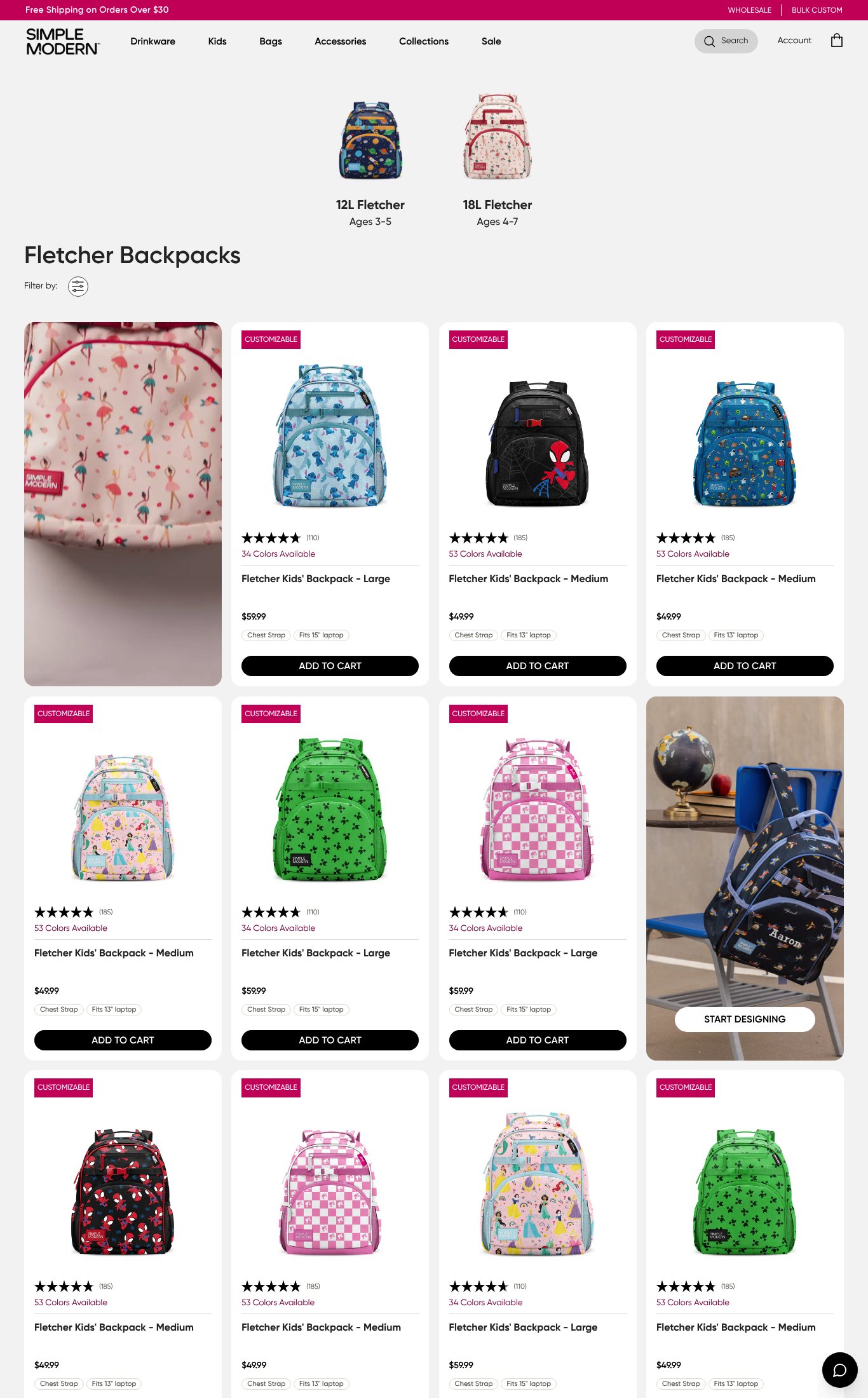
Simple Modern's Fletcher Backpack page is actually a collection grid rather than a dedicated product page, which is the single most critical structural gap — a visitor arriving via the 'large' URL gets no pre-selected product, no value proposition, and no single focused CTA. The brand's strongest dimension is social proof at the card level, with 100+ reviews and clear star ratings on every product tile. The most urgent fix is building a true single-product landing experience that matches the URL, adds a benefit headline, and includes a sticky mobile CTA.
Top Finding
This is a collection/category page, not a single product page. The URL targets 'fletcher-kids-backpack-large' but the page renders a grid of multiple SKUs (Large and Medium, $59.99 and $49.99) with a 'Filter by' control. There is no single hero value proposition — the page headline reads only 'Fletcher Backpacks', which is a product line name, not a benefit-driven statement.
clarity · critical
+12 more findings in the full teardown
Get the full teardown
Score breakdown across all 5 dimensions, every finding, prioritized fix list, and category benchmark position.