Revolution Tea
Kitchenrevolutiontea.com
Average
out of 100
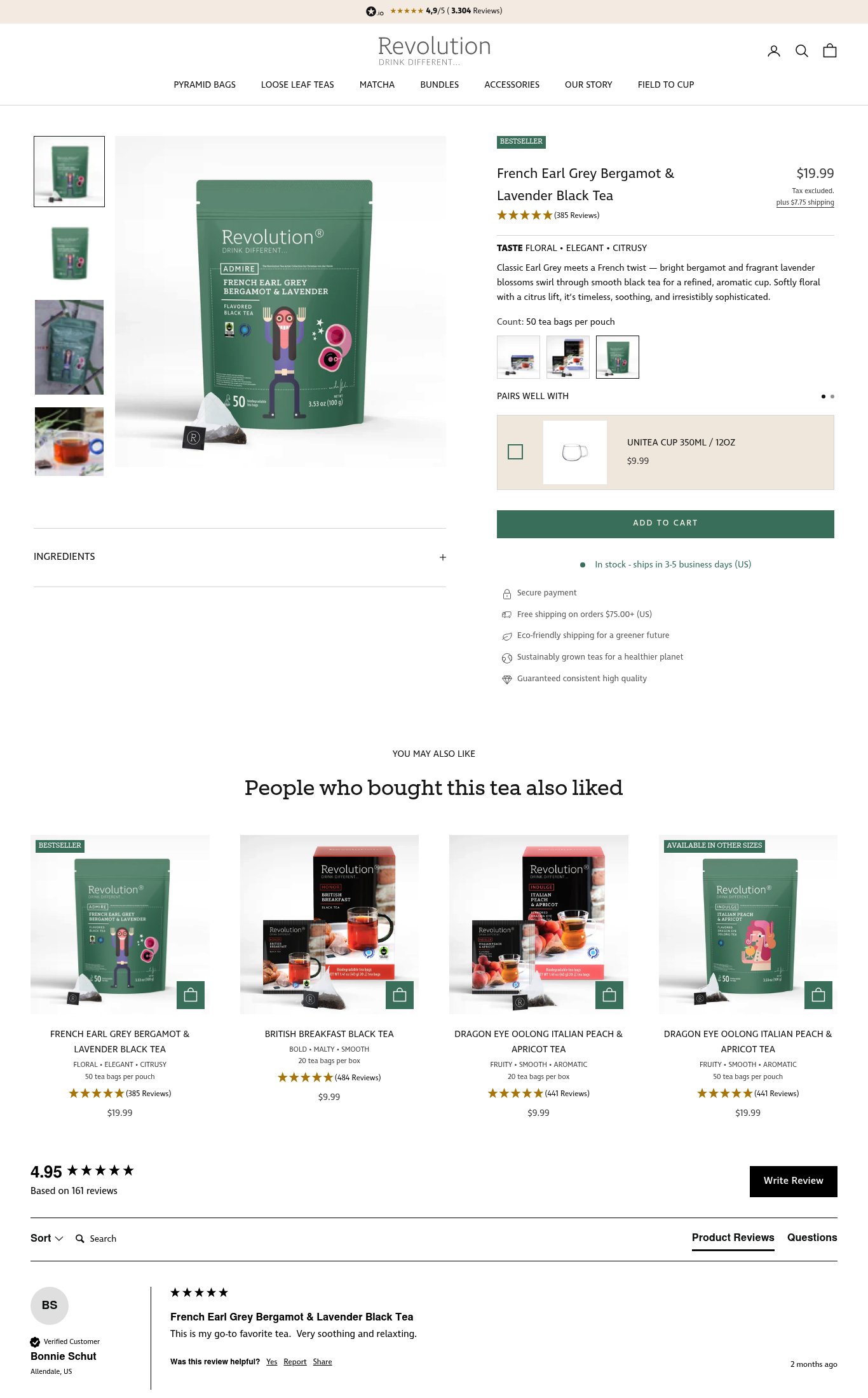
Revolution Tea's product page is competent and well-structured — the product name, price, taste descriptors, and stock/shipping info are all above the fold on mobile, and the 'BESTSELLER' badge plus star rating provide immediate credibility. The brand's strongest dimension is Clarity, with clean information hierarchy and a readable mobile layout. The single most critical gap is the absence of a sticky Add to Cart button combined with a slow 5.1s mobile LCP, meaning users who do scroll are losing the CTA and cold visitors are bouncing before the page even renders.
Top Finding
The 'ADD TO CART' button is a full-width green button on mobile but does NOT appear to be sticky on scroll — it is positioned mid-page and disappears as the user scrolls into the recommendations and review sections, requiring the user to scroll back up to purchase.
purchase friction · high
+11 more findings in the full teardown
Get the full teardown
Score breakdown across all 5 dimensions, every finding, prioritized fix list, and category benchmark position.