Red Clay Hot Sauce
Food & Beverageredclayhotsauce.com
Average
out of 100
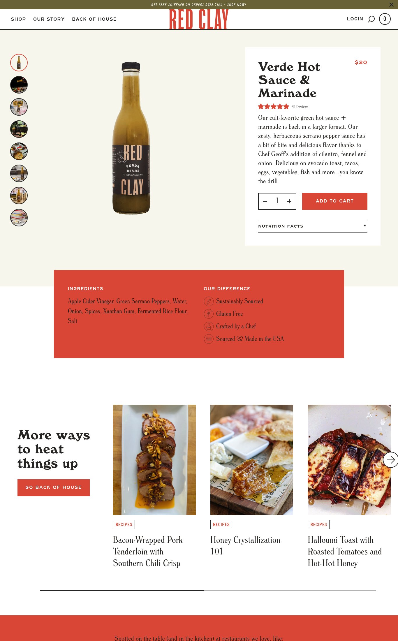
Red Clay Hot Sauce has a clean, on-brand page with solid product naming, visible pricing, and a respectable image count — its strongest dimension is clarity, where the core product information is present and readable. However, the page is critically undermined by a missing sticky CTA on mobile, lifestyle imagery locked below the fold in a recipe section rather than the product carousel, and a catastrophic PSI LCP of 81 seconds that will cause most cold mobile visitors to bounce before they ever see the product. Social proof is present but thin, with no photo reviews or press logos surfaced near the buy button.
Top Finding
The 'ADD TO CART' button is not sticky on mobile scroll — once the user scrolls past the product info section into the ingredients block and recipe section, the CTA disappears entirely. There is no persistent floating button or sticky footer bar.
purchase friction · critical
+8 more findings in the full teardown
Get the full teardown
Score breakdown across all 5 dimensions, every finding, prioritized fix list, and category benchmark position.