Pure Indian Foods
Food & Beveragepureindianfoods.com
Average
out of 100
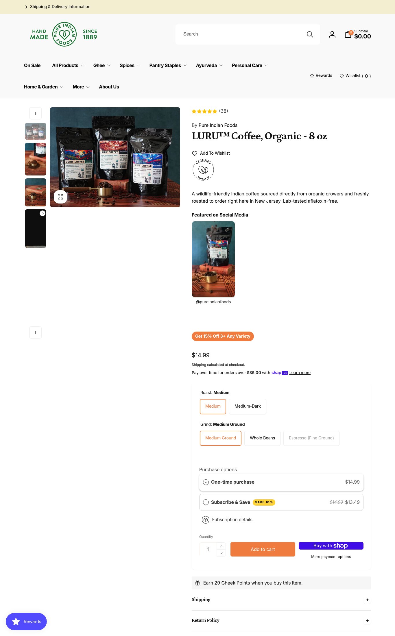
Pure Indian Foods has a functional product page with solid variant UX and a Subscribe & Save option, but it underperforms on the fundamentals that drive mobile conversion. The brand's strongest dimension is purchase friction mechanics (variant pickers, subscription toggle), but the single most critical gap is the complete absence of a sticky Add to Cart CTA on mobile — combined with a 6.8s LCP, cold visitors are asked to scroll through a slow-loading, CTA-free experience before they can even buy.
Top Finding
On mobile, the 'Add to Cart' button is not sticky — it does not appear until the user scrolls past the product description, social media section, bundle promo badge, price, variant pickers (Roast + Grind), and purchase options (one-time vs. Subscribe & Save). There is no persistent sticky CTA bar on mobile scroll.
purchase friction · critical
+11 more findings in the full teardown
Get the full teardown
Score breakdown across all 5 dimensions, every finding, prioritized fix list, and category benchmark position.