Pelsbarn
Petpelsbarn.org
Solid
out of 100
Summary
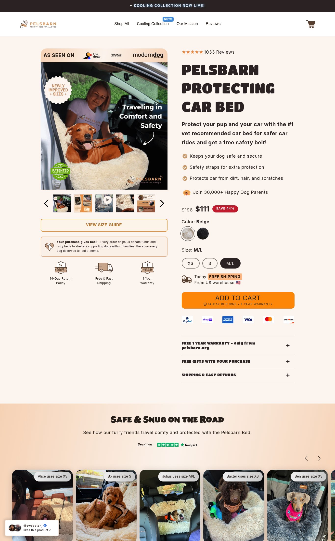
Pelsbarn's Protecting Car Bed page is a well-structured, conversion-focused product page with strong clarity, credible press logos, 1,033 reviews above the fold, and compelling lifestyle imagery. Its strongest dimension is Clarity — the product name, price, discount, and value proposition are all immediately visible on mobile. The single most critical gap is mobile load performance: a 7.9s LCP on cold mobile load will bleed conversion from every paid traffic source, and fixing it should be the team's first priority before any creative or copy optimization.
AI-Shoppable
92 / 100 · StrongProduct structured data is present and AI crawlers are allowed. 1 of 11 signals still missing.
What’s limiting AI from reading this page
- Ratings in structured data.
AI shopping assistants and answer engines read a page through its structured data and crawler access. Each item above is a reason this page is harder for them to read, understand, or recommend.
Top Fixes
- 1
Fix LCP (7.9s) immediately — preload the hero image, compress and serve it in WebP, and defer non-critical scripts. A 7.9s LCP is losing a significant portion of paid traffic before the page even renders. This is the single highest-ROI fix on the page.
- 2
Surface 2–3 UGC photo reviews (with dog photos and size labels) directly below the CTA on mobile — don't make customers scroll to the bottom to see social proof. Moving 'Alice uses size XS' style photos near the Add to Cart button will directly reduce purchase hesitation.
- 3
Expand the 'FREE GIFTS WITH YOUR PURCHASE' accordion by default or replace it with an inline callout naming the specific gift (e.g., 'Free Safety Belt Included — $29 value') near the price. Hidden value doesn't convert; visible value does.
Findings
PSI mobile score is 68/100 (5 pts). LCP of 7.9s is critically slow — a first-time mobile visitor on a cold load waits nearly 8 seconds to see the largest content element. FCP of 3.2s means the page feels blank for over 3 seconds. This directly kills conversion for paid traffic landing on this page.
mobile performance · critical
The 'ADD TO CART' button is large, orange, and dominant on mobile. It appears below the variant selectors and includes inline reassurance copy '14-DAY RETURNS • 1-YEAR WARRANTY' directly beneath the button text. A sticky CTA is not confirmed visible on scroll from the screenshot, which could reduce one-tap accessibility mid-page.
purchase friction · medium
Customer photo reviews (UGC) with real dogs and size labels ('Alice uses size XS', 'Bo uses size S', etc.) are visible on desktop below the fold. On mobile, only the beginning of this section is visible at the bottom of the screenshot. These are high-quality UGC photos but require scrolling to reach — they are not surfaced near the CTA.
social proof · medium
No autoplay video or embedded video is visible above the fold on mobile — the video thumbnail is buried in the carousel and requires a swipe to reach. A short autoplay loop showing the bed being installed or a dog riding in it would significantly increase engagement.
visual merch · medium
No subscribe & save toggle, bundle offer, or 'frequently bought together' upsell is visible on the page. The 'FREE GIFTS WITH YOUR PURCHASE' accordion is collapsed — the gift is not immediately visible, which reduces its persuasive impact. Expanding this by default or surfacing the gift item inline near the CTA would reduce friction and increase perceived value.
purchase friction · medium
Desktop thumbnail strip shows 5+ images including lifestyle (dog in car with owner), product detail, and what appears to be a video thumbnail (play icon visible on third thumbnail). Mobile carousel shows 4 visible thumbnails with arrows. Lifestyle hero image is strong — dog and owner in a real car setting with the bed in use.
visual merch · low
Body text is legible at normal viewing distance on mobile — font sizes appear adequate, contrast is good (dark text on light background). The 'ADD TO CART' button is positioned in the lower-middle of the mobile viewport and appears reachable in the thumb zone, though it is not confirmed sticky on scroll.
mobile performance · low
Product name 'Pelsbarn Protecting Car Bed' is visible above the fold on mobile, price ($111, SAVE 44%) is clearly shown with strikethrough $198, and the hero subheadline 'Protect your pup and your car with the #1 vet recommended car bed for safer car rides and get a free safety belt!' is a strong value proposition. Target customer (dog owners who travel) is immediately clear. CTA reads 'ADD TO CART' — functional but generic.
clarity · low
Star rating (5 stars) and '1033 Reviews' are visible near the top of the product section on both mobile and desktop — well above the fold. Trustpilot 'Excellent' badge appears below the fold in the UGC section. 'As Seen On' bar with The Dodo, Travel + Leisure, and Modern Dog logos is prominent at the very top of the product imagery.
social proof · low
CTA copy is the baseline 'ADD TO CART' (2/4 pts). A more specific CTA like 'Get My Car Bed' or 'Protect My Pup' would reinforce the value proposition and lift conversion.
clarity · low
Want this done for your brand?
We score your product page from the outside, cold, on mobile, no install.
Request a teardown →