Notorious Cookware
Kitchennotoriouscookware.com
Solid
out of 100
Summary
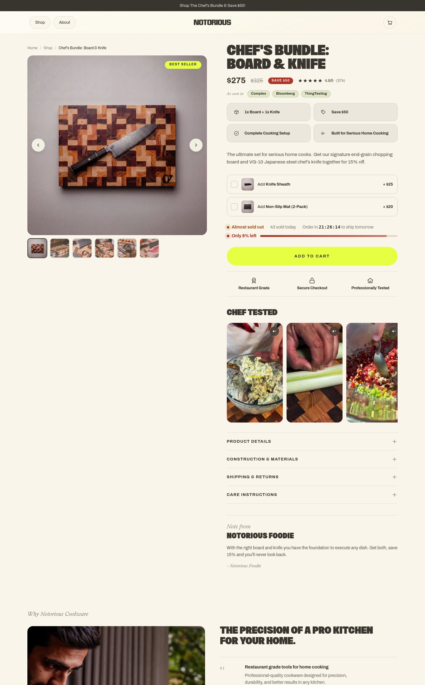
Notorious Cookware's Chef's Bundle page is a well-structured, conversion-intentional page with strong clarity above the fold — clear product name, bold savings callout, press mentions, and 374 reviews at 4.9/5 all visible without scrolling. Social proof placement and the urgency/scarcity bar are genuine strengths. The single most critical gap is a catastrophic 18.5-second LCP that will cause the majority of cold mobile visitors — especially paid traffic — to bounce before the page even loads, making every other optimization on the page irrelevant until it is resolved.
AI-Shoppable
32 / 100 · WeakNo Product structured data found — AI shopping agents and answer engines can't reliably read this page's name, price, or availability, so it's unlikely to be surfaced as a recommendation.
Why AI can’t read this page
- Product structured data (JSON-LD). No Product schema — AI agents can't parse the product
- Price in structured data.
- Availability in structured data.
- Ratings in structured data.
- Brand in structured data.
- Image in structured data.
- Description in structured data.
- SKU / GTIN identifier.
AI shopping assistants and answer engines read a page through its structured data and crawler access. Each item above is a reason this page is harder for them to read, understand, or recommend.
Top Fixes
- 1
Fix the 18.5s LCP immediately — audit and lazy-load or compress the hero image, defer non-critical JS, and consider serving next-gen image formats (WebP/AVIF). A $275 bundle page losing visitors before it loads is the single highest-ROI fix available.
- 2
Add a sticky 'ADD TO CART' bar that anchors to the bottom of the mobile viewport on scroll — the current button disappears as users browse the Chef Tested videos and accordion sections, forcing them to scroll back up to convert.
- 3
Surface free shipping threshold or a concrete delivery promise (e.g., 'Free shipping on orders over $X · Arrives in 3–5 days') directly on the product page above or below the CTA — do not hide it inside the Shipping & Returns accordion.
Findings
PSI mobile score is 56/100 with an LCP of 18.5 seconds and FCP of 4.0 seconds. An 18.5s LCP is severely damaging — a first-time cold visitor on mobile will see a blank or partially loaded page for nearly 20 seconds before the largest content element renders. This directly kills conversion for paid traffic landing on this page.
mobile performance · critical
The 'ADD TO CART' button is a large, high-contrast yellow-green button visible on mobile, but it does NOT appear to be sticky on scroll — it sits in a fixed position in the page flow and is not anchored to the bottom of the viewport. A visitor scrolling through the Chef Tested videos or accordion sections loses immediate access to the CTA.
purchase friction · high
Shipping clarity is hidden behind the 'Shipping & Returns' accordion — no free shipping threshold or delivery estimate is surfaced on the page itself. The urgency bar ('Order in 21:26:14 to ship tomorrow') implies next-day shipping but does not state the cost or free threshold, leaving a key objection unanswered before the CTA.
purchase friction · high
Six thumbnail images are visible in the carousel (5+ = full marks on count), and the 'Chef Tested' section below features video thumbnails (play icons visible on lifestyle cooking clips), earning video credit. However, the hero image on mobile is a flat lay product-on-grey-background shot — the lifestyle/in-use imagery is buried below the fold in the Chef Tested section rather than leading the carousel.
visual merch · medium
Star rating (4.9/5) and review count (374) are visible directly below the price above the fold on mobile — strong placement. 'As seen in' bar with Complex, Bloomberg, and ThingTesting pill badges appears immediately below the rating. However, no customer photo reviews are visible anywhere in the scrollable page screenshots, and the review section itself is not shown — only the aggregate star/count widget is present near the fold.
social proof · medium
Product name 'Chef's Bundle: Board & Knife' is visible above the fold on mobile, price $275 (with $325 strikethrough and 'SAVE $50' badge) is prominent, and the 4-bullet value grid (1x Board + 1x Knife, Save $50, Complete Cooking Setup, Built for Serious Home Cooking) communicates the offer clearly. The hero value prop copy 'The ultimate set for serious home cooks' is present but sits below the fold on mobile. CTA reads generic 'ADD TO CART' rather than something specific like 'Get the Bundle'.
clarity · low
The 'As seen in' press badges (Complex, Bloomberg, ThingTesting) are named publications and earn press-mention credit, but they are rendered as small pill tags rather than recognizable logos, reducing their visual authority. No certification badges (e.g., food-safe, chef-endorsed with a named chef) are present.
social proof · low
Add-on upsells (Knife Sheath +$25, Non-Slip Mat 2-Pack +$20) are presented as checkbox add-ons directly on the page — a solid bundle/upsell mechanism. However, there is no subscribe & save toggle or subscription option visible, missing a recurring revenue opportunity for consumable-adjacent accessories.
purchase friction · low
Want this done for your brand?
We score your product page from the outside, cold, on mobile, no install.
Request a teardown →