Magic Mind
Food & Beveragemagicmind.com
Average
out of 100
Summary
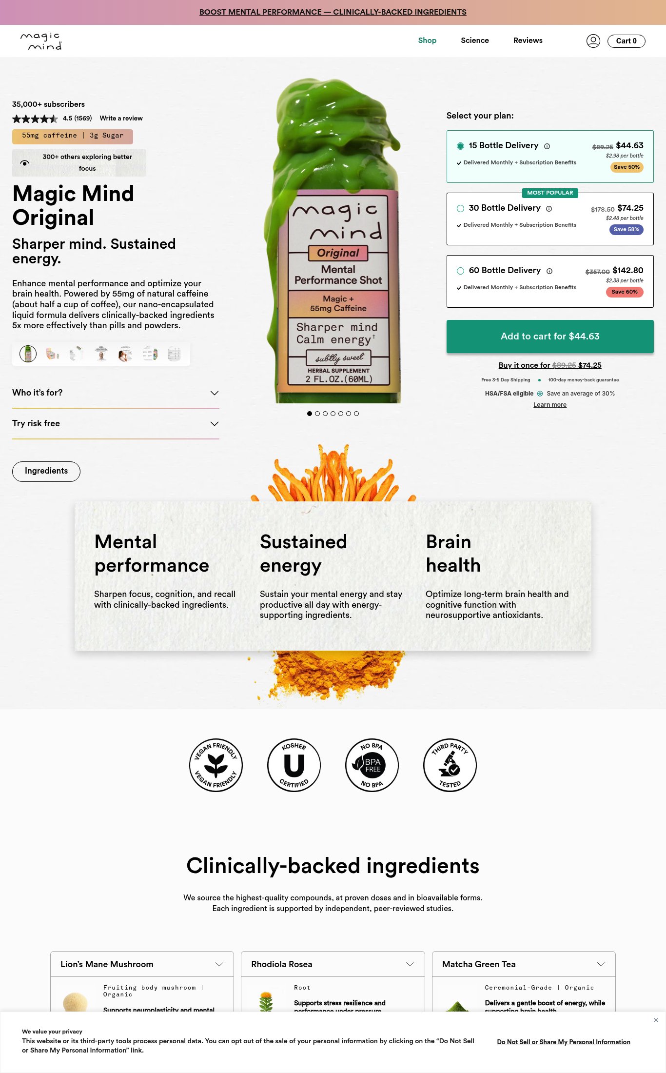
Magic Mind Original has a genuinely strong above-the-fold clarity package — product name, tagline, price, specs, and 1,569 reviews are all visible before the first scroll on mobile, and the price-embedded CTA copy is best-in-class. The brand's biggest strength is its purchase friction architecture: subscription tiers, savings badges, free shipping, and a 100-day guarantee are all well-placed near the CTA. However, the page is critically undermined by a 27/100 PSI mobile score (LCP 45.7s) that will cause most cold mobile visitors to abandon before seeing any of this — fixing page speed is the single highest-leverage action available.
AI-Shoppable
92 / 100 · StrongProduct structured data is present and AI crawlers are allowed. 1 of 11 signals still missing.
What’s limiting AI from reading this page
- Ratings in structured data.
AI shopping assistants and answer engines read a page through its structured data and crawler access. Each item above is a reason this page is harder for them to read, understand, or recommend.
Top Fixes
- 1
Fix mobile page speed immediately — a 27/100 PSI score with a 45.7s LCP means the majority of cold mobile visitors never see the page. Audit and defer non-critical JavaScript (TBT is 2,380ms), lazy-load below-fold images, and serve next-gen image formats. This is a revenue emergency, not a nice-to-have.
- 2
Add a sticky 'Add to Cart' bar on mobile scroll — the current CTA disappears as users scroll through the ingredient and benefit content below the fold. A persistent bottom bar with the price and CTA button would capture intent at any scroll depth on this content-heavy page.
- 3
Add video content to the hero carousel — a 15–30 second autoplay loop showing the product being used (morning routine, someone at a desk, the liquid being poured) or a founder/science explainer would dramatically improve the emotional and credibility sell for a $44+ supplement purchase. No video is currently present anywhere on the page.
Findings
PSI mobile score is 27/100 — catastrophic. LCP of 45.7s and FCP of 6.7s mean most cold mobile visitors will bounce before the page renders. TBT of 2,380ms signals heavy JavaScript blocking the main thread. This is the single biggest conversion killer on the page.
mobile performance · critical
The teal 'Add to cart for $44.63' button is large and prominent on mobile. However, there is no evidence of a sticky CTA bar on scroll — as the user scrolls through the long ingredient and benefit sections below the fold, the CTA disappears. This is a meaningful friction point on a content-heavy page.
purchase friction · high
No video content is visible anywhere on the page — no autoplay loop, no embedded video thumbnail, no play button. For a supplement brand making efficacy claims ('5x more effectively than pills and powders'), a short explainer or testimonial video would significantly strengthen the sell.
visual merch · high
No press mentions or 'As Seen In' bar is visible on the page. For a nootropic brand making clinical efficacy claims, named press coverage (e.g., Forbes, Men's Health, TechCrunch) or third-party editorial validation would meaningfully reduce skepticism. Certification badges (Vegan Friendly, Kosher, BPA Free, Third Party Tested) are present on desktop but appear below the fold — they are not visible in the mobile above-fold area.
social proof · medium
Image carousel shows 7 dots on mobile, indicating 7+ images — full points for image count. However, the visible hero image is a product-on-white-background shot. Lifestyle imagery (product in use, person holding it, morning routine context) is not visible in the primary hero position on mobile, reducing the emotional sell.
visual merch · medium
No customer photo reviews or UGC are visible in the screenshots. The review section shows star ratings and a 'Write a review' link but no photo testimonials are surfaced near the purchase zone.
social proof · medium
Product name 'Magic Mind Original', tagline 'Sharper mind. Sustained energy.', price ($44.63), and key specs ('55mg caffeine | 3g Sugar') are all visible above the fold on mobile without scrolling. This is a strong above-the-fold package — nearly everything a first-time visitor needs to orient is present immediately.
clarity · low
CTA copy reads 'Add to cart for $44.63' — price-embedded CTA is specific and reduces hesitation. Scores at the top of the range for CTA specificity.
clarity · low
Star rating (4.5) and review count (1,569) are visible near the top of the mobile page, above the fold alongside '35,000+ subscribers'. Review volume of 1,569 earns full volume points. The social proof placement is excellent — it appears before the product description.
social proof · low
Subscription plan selection (15, 30, 60 bottle delivery) is clearly laid out with savings percentages ('Save 50%', 'Save 58%', 'Save 60%') and per-bottle pricing. The 'MOST POPULAR' badge on the 30-bottle option guides decision-making. A one-time purchase option ('Buy it once for $74.25') is also visible below the CTA, giving flexibility without confusion.
purchase friction · low
'Free 3-5 Day Shipping' and '100-day money-back guarantee' are visible directly below the CTA on mobile — strong placement. HSA/FSA eligibility is also called out, which is a meaningful trust signal for a health product. These are well-executed friction reducers.
purchase friction · low
Want this done for your brand?
We score your product page from the outside, cold, on mobile, no install.
Request a teardown →