LUXOME
Home Goodscheckout.luxome.com
Average
out of 100
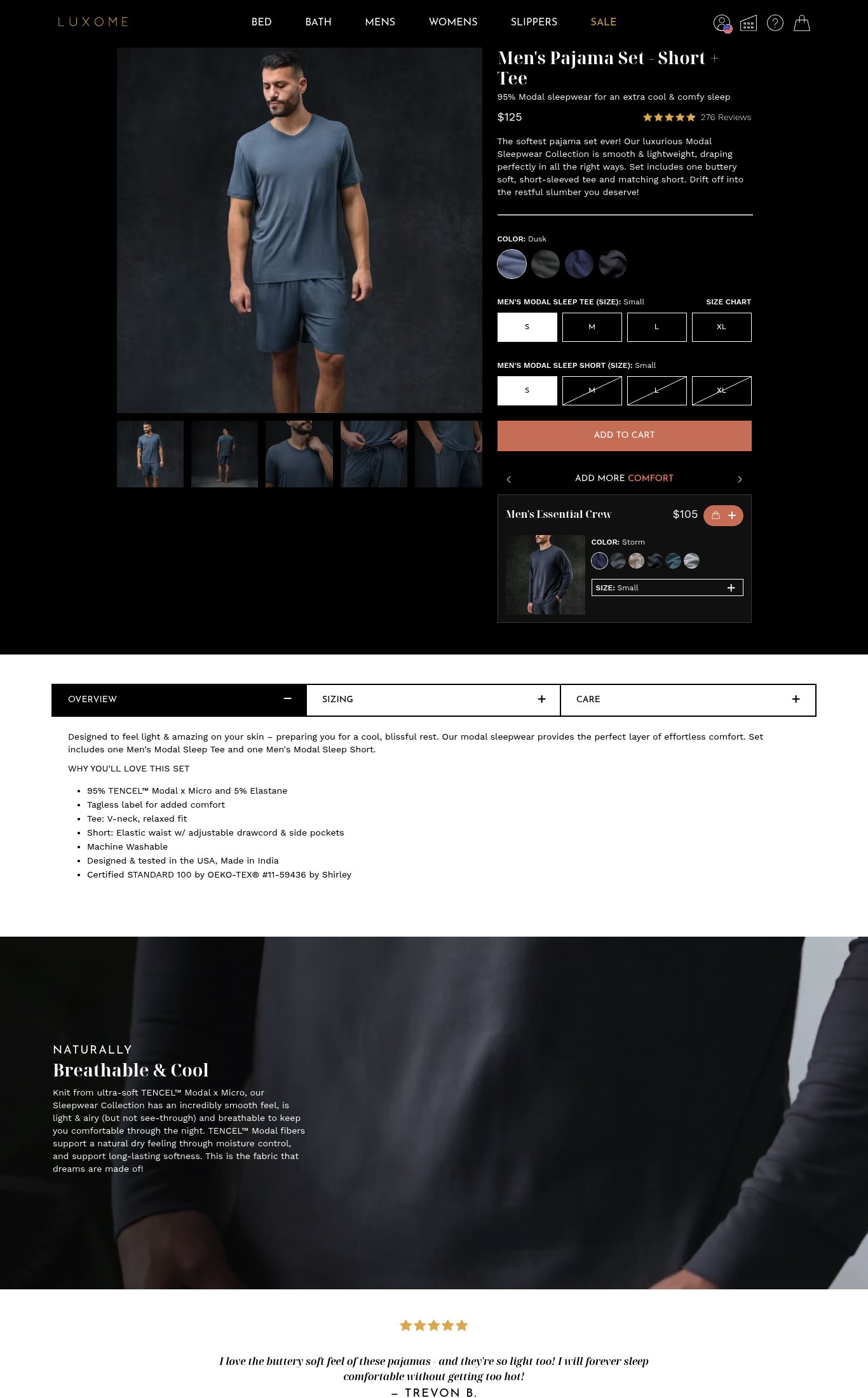
LUXOME's product page has a solid structural foundation — product name, price, star rating, and review count are all above the fold on mobile, and the variant selection UX is clean. The brand's strongest dimension is Clarity, where the essentials are well-organized and the sub-headline communicates a clear fabric benefit. The single most critical gap is mobile performance: a PSI score of 45 with an 18.6-second LCP means the majority of cold mobile visitors will bounce before the page loads, and the absence of a sticky CTA compounds the conversion loss for those who do stay.
Top Finding
The 'ADD TO CART' button is visible above the fold on mobile and appears in a warm terracotta/orange color that contrasts well against the dark background. However, there is no sticky CTA bar observed on scroll — once the user scrolls past the variant selectors, the button disappears and requires scrolling back up to purchase.
purchase friction · high
+8 more findings in the full teardown
Get the full teardown
Score breakdown across all 5 dimensions, every finding, prioritized fix list, and category benchmark position.