Loopy Cases
Electronicsloopycases.com
Average
out of 100
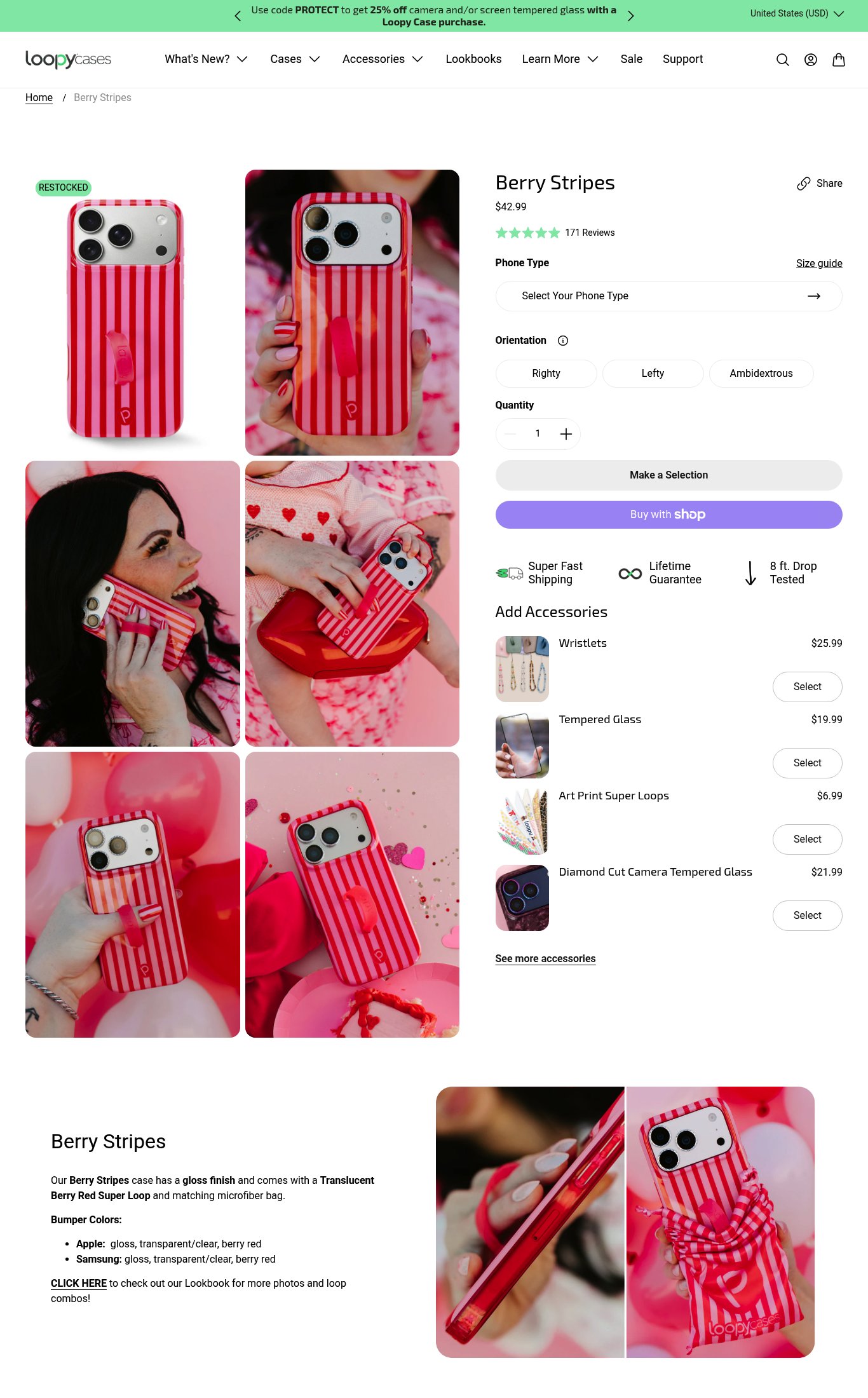
Loopy Cases has a visually strong product page with good lifestyle imagery, a clean layout, and a functional accessory upsell module — social proof placement near the title is a genuine strength. However, the page is critically undermined by a 60.1-second LCP that will cause most cold mobile visitors to bounce before the hero image loads, and the absence of a sticky CTA means users who do scroll have no persistent path to purchase. The single most critical gap is mobile page speed, which renders all other conversion optimizations moot for the majority of mobile traffic.
Top Finding
The primary CTA 'Make a Selection' is not sticky on mobile scroll — once the user scrolls past the button area into the description and accessories section, there is no persistent Add to Cart button anchored to the bottom of the screen. The 'Buy with Shop' button is present but secondary. A cold visitor scrolling through accessories has no one-tap path back to purchase.
purchase friction · critical
+9 more findings in the full teardown
Get the full teardown
Score breakdown across all 5 dimensions, every finding, prioritized fix list, and category benchmark position.