Kuvera Jewelry
Jewelrykuverajewelry.com
Average
out of 100
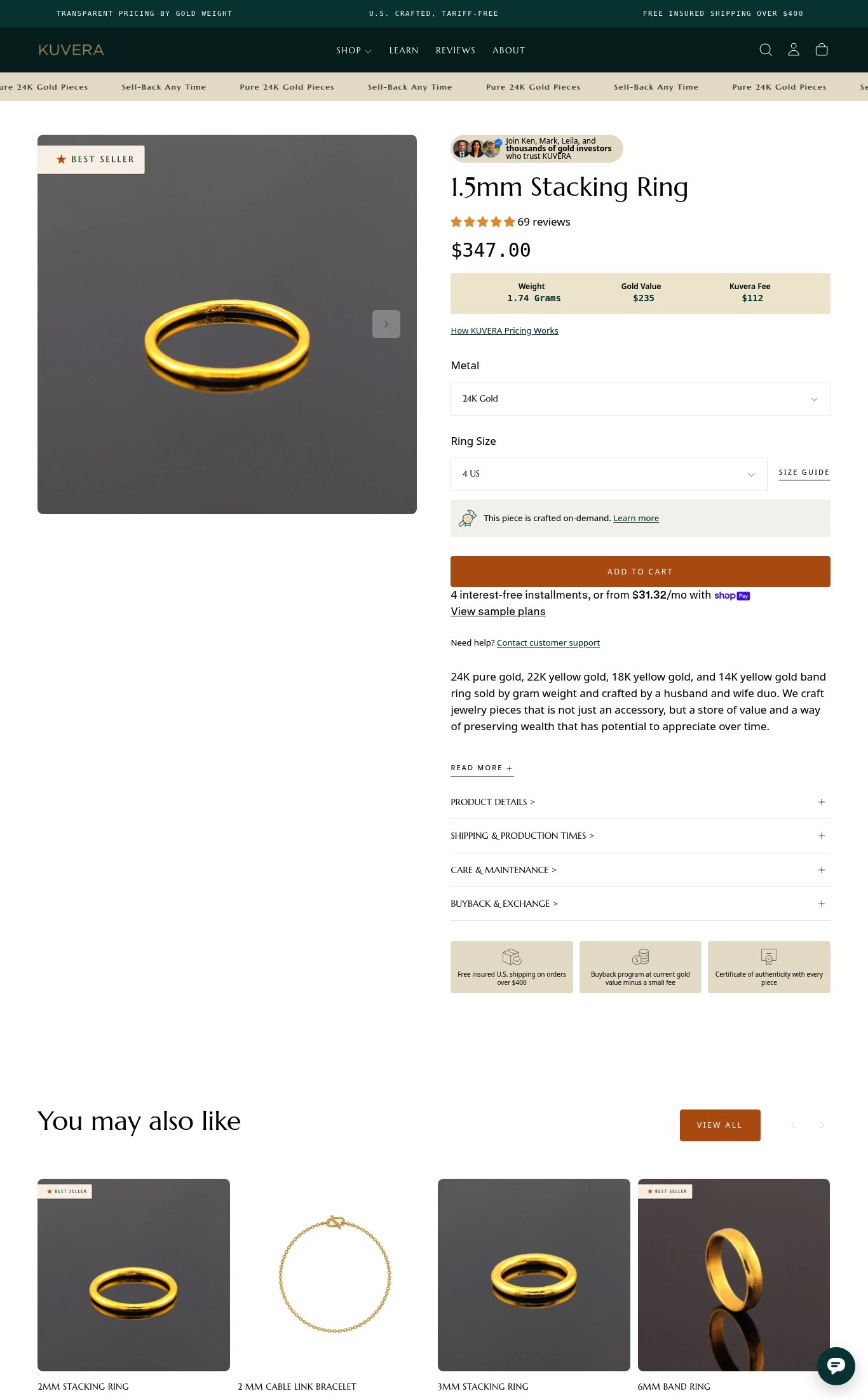
Kuvera has a genuinely differentiated product concept — transparent gram-weight pricing for 24K gold jewelry — and the pricing breakdown table is the page's strongest clarity asset. However, the page is critically undermined by a missing sticky CTA on mobile, a 41/100 PSI score with a 19-second LCP, and no video or photo reviews to build trust for a $347 purchase. The single most critical gap is the absence of a persistent mobile Add to Cart button, which means the page's best visitors — those who engage with the pricing table and variant selectors — have no frictionless path to purchase.
Top Finding
The 'ADD TO CART' button is prominent and uses a high-contrast orange color, but on mobile it sits below the fold — the user must scroll past the image gallery, social proof widget, product name, price, pricing table, metal selector, and ring size selector before reaching it. There is no sticky Add to Cart bar visible on mobile scroll.
purchase friction · critical
+9 more findings in the full teardown
Get the full teardown
Score breakdown across all 5 dimensions, every finding, prioritized fix list, and category benchmark position.