Jones Road Beauty
Beautyjonesroadbeauty.com
Solid
out of 100
Summary
Jones Road Beauty's Blushing Stick page is a solid, well-structured DTC product page with strong social proof placement (651 reviews near the fold), a genuine UGC 'As Seen On You' section, and a healthy image gallery. The brand's strongest dimension is social proof, anchored by high review volume and real customer photos. The single most critical gap is the absence of a sticky Add to Cart CTA on mobile combined with a 10.1-second LCP — together these create a scenario where a cold mobile visitor may bounce before the page loads and, if they stay, loses the purchase button the moment they start exploring.
AI-Shoppable
100 / 100 · StrongProduct structured data is present and AI crawlers are allowed. 0 of 11 signals still missing.
Top Fixes
- 1
Implement a sticky Add to Cart bar on mobile scroll — the $34 CTA disappears as users browse shade options and product details, forcing them to scroll back up to purchase. A persistent bottom bar with shade name + price + 'Add to Cart' would directly lift conversion.
- 2
Reduce LCP from 10.1s by lazy-loading below-fold images, compressing the hero product image, and serving next-gen formats (WebP/AVIF). A 10-second hero load on cold mobile is a critical drop-off point before the page even renders.
- 3
Add a hero value proposition line above the fold — something like 'Lip + cheek color in seconds. No brush needed.' The product name alone doesn't sell the use case. A single benefit-led sentence between the product name and shade selector would immediately answer 'why this product.'
Findings
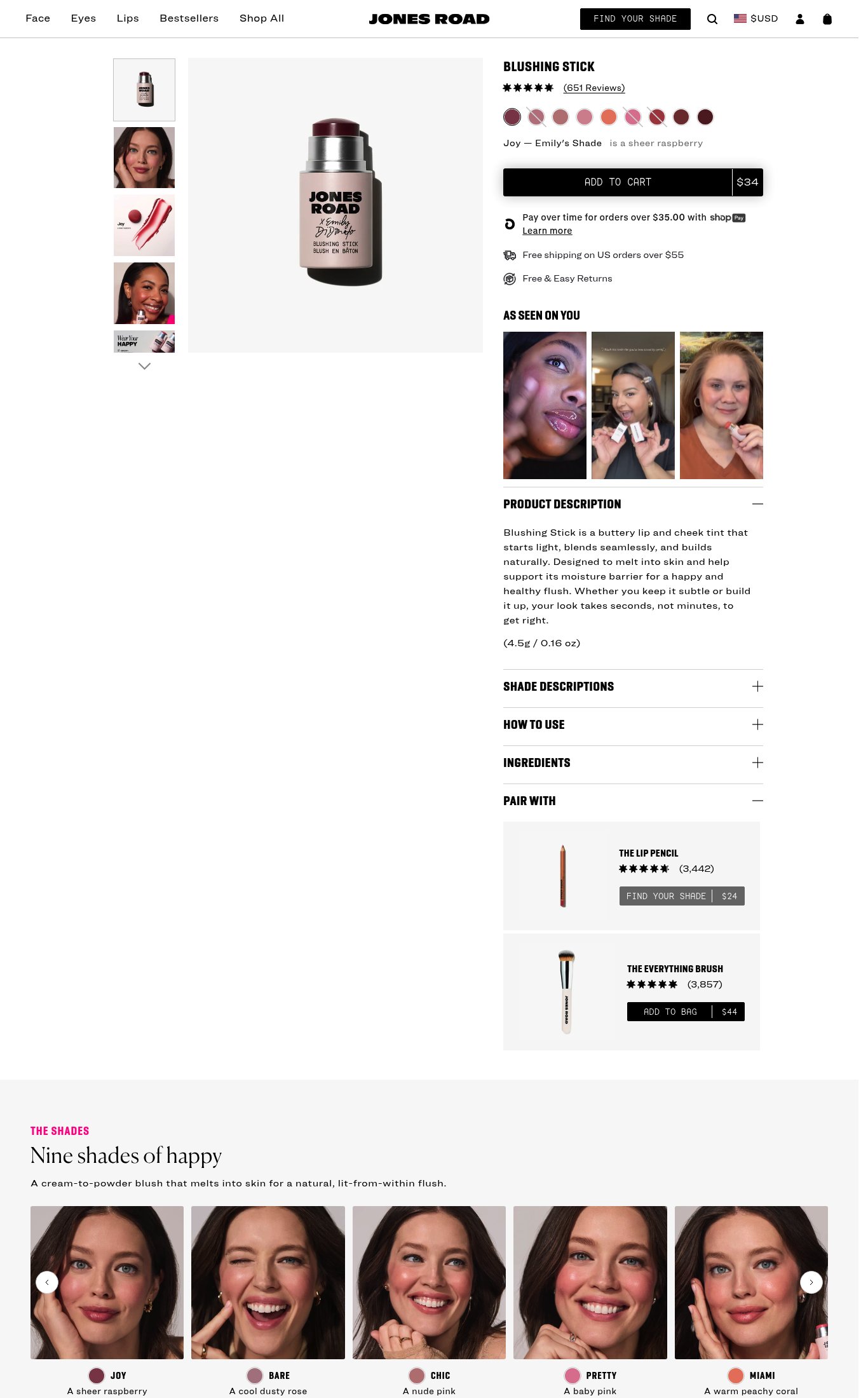
The Add to Cart button is prominent above the fold on mobile but does not appear to be sticky on scroll — as the user scrolls down through shade descriptions, product description, and pair-with section, the CTA disappears. No persistent sticky bar is visible in the mobile screenshot.
purchase friction · high
PSI mobile score is 64/100 with LCP of 10.1 seconds and FCP of 3.9 seconds. A 10-second LCP means the hero product image takes over 10 seconds to fully render on a cold mobile load — well above the 2.5s good threshold. This will cause significant bounce on first-time mobile visits.
mobile performance · critical
No video content is visible anywhere on the page — no autoplay loop, no embedded video, no video thumbnail. For a color cosmetic product where application technique and payoff are key purchase drivers, this is a missed opportunity.
visual merch · high
Product name 'BLUSHING STICK' is visible above the fold on mobile, price '$34' is embedded in the Add to Cart button and clearly readable. However, there is no standalone hero headline or value proposition — the product description ('a buttery lip and cheek tint that starts light, blends seamlessly...') is buried below the fold in a collapsed accordion section. The above-fold area has no 'why buy this' hook.
clarity · medium
Free shipping threshold ('Free shipping on US orders over $55') and 'Free & Easy Returns' are both visible directly below the Add to Cart button on mobile — good placement. However, the $34 product price falls below the $55 free shipping threshold, which could create hesitation without a clear path to qualify (e.g., 'Add $21 more for free shipping').
purchase friction · medium
'AS SEEN ON YOU' UGC photo grid appears on the page with real customer photos showing the product in use on diverse skin tones. This is strong social proof. However, there are no named press mentions or 'As Seen In' media bar (e.g., Vogue, Allure) visible anywhere on the page.
social proof · medium
'PAIR WITH' section shows The Lip Pencil (3,442 reviews) and The Everything Brush (3,857 reviews) with individual Add to Bag CTAs — a functional cross-sell. However, there is no subscribe-and-save toggle or bundle discount offer visible, leaving recurring revenue on the table.
purchase friction · medium
CTA copy reads 'ADD TO CART' — baseline generic copy. No differentiated language like 'Find Your Shade' or 'Get the Flush' that would reinforce the product's identity or urgency.
clarity · low
Desktop thumbnail rail shows at least 5 images including lifestyle shots of the product on-skin and a swatch image. Mobile carousel shows 7 dot indicators, confirming 7+ images. Image count is strong.
visual merch · low
Star rating (5 stars) and review count '(651 Reviews)' are visible directly below the product name, near the top of the page on both mobile and desktop — well-placed and immediately credible.
social proof · low
Want this done for your brand?
We score your product page from the outside, cold, on mobile, no install.
Request a teardown →