Jigsaw Health
Supplementsjigsawhealth.com
Solid
out of 100
Summary
Jigsaw Health's MagSRT page has a strong foundation: a benefit-led headline, 8,838 reviews with star rating above the fold, clear shipping and return policies, and a well-structured subscribe-and-save offer. The brand's strongest dimension is clarity — the value proposition and social proof count are immediately readable on mobile. The single most critical gap is the absence of a sticky CTA on mobile combined with a 21-second LCP, meaning visitors who do scroll are met with a slow experience and no persistent buy button to capture intent.
AI-Shoppable
100 / 100 · StrongProduct structured data is present and AI crawlers are allowed. 0 of 11 signals still missing.
Top Fixes
- 1
Add a sticky 'Subscribe & Save' CTA bar that persists on mobile scroll — right now a visitor reading the accordion sections has no visible buy button, and this is the single highest-impact conversion fix on the page.
- 2
Compress and lazy-load the hero banner image to bring LCP down from 21.0s — consider serving a smaller WebP hero on mobile or using a CSS-based hero instead of a full image to dramatically improve cold-load speed.
- 3
Surface at least 2–3 customer photo reviews above the fold or in a visible carousel before the accordion — the 8,838 rating count is strong social proof but hiding all reviews behind a collapsed section wastes that trust equity.
Findings
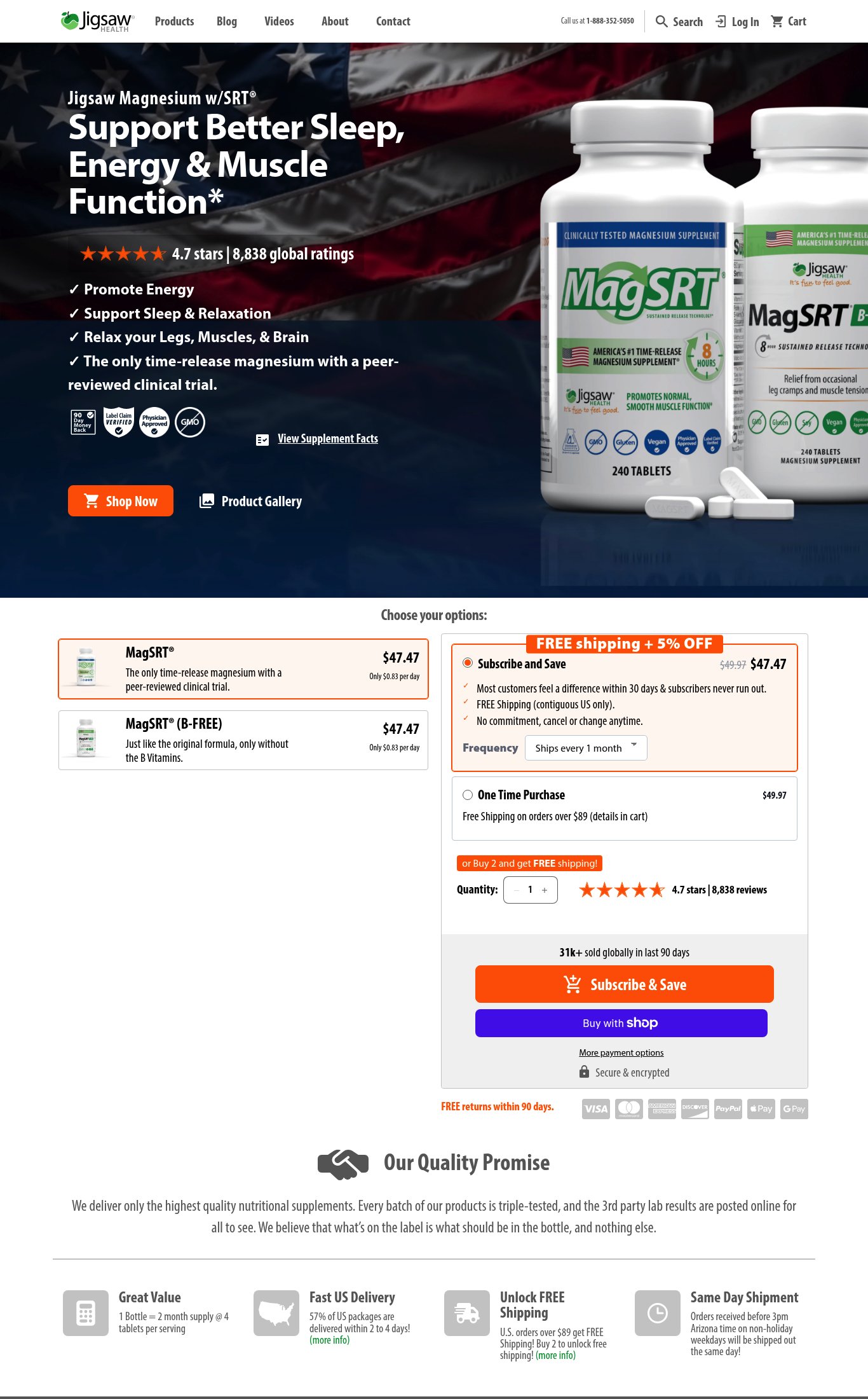
The 'Subscribe & Save' CTA button is orange and prominent, but it is NOT sticky on mobile scroll — it appears only at a fixed position in the page flow. A visitor scrolling through the accordion content (Description, Video, Ingredients, etc.) has no persistent CTA visible.
purchase friction · high
PSI mobile score is 65/100 with an LCP of 21.0 seconds — critically slow largest contentful paint. The hero banner image is likely the LCP element and is not optimized for cold mobile load. FCP of 3.3s is also above acceptable thresholds for DTC conversion.
mobile performance · critical
Price is NOT visible above the fold on mobile. The hero image carousel occupies the full viewport below the headline, pushing the variant selector and price ($47.47) below the fold. A first-time visitor must scroll to see what this costs.
clarity · high
A 'Video' section exists on the page (visible as a collapsed accordion on mobile), but no video is autoplaying or visible above the fold. The video is hidden behind a tap/expand interaction, meaning most mobile visitors will never see it.
visual merch · high
Reviews section is collapsed in an accordion at the bottom of the mobile page. No customer photo reviews or UGC are visible anywhere on the page without tapping to expand. Press mentions or 'As Seen In' bar are absent — trust badges shown (90-day money back, Label Claim Verified, Physician Approved, Non-GMO) are certification-style badges, not named press outlets.
social proof · high
The mobile hero image carousel shows 6 dot indicators, suggesting 6 images, but the hero image is a branded lifestyle/patriotic banner ('America loves MagSRT.') with product bottles — not a true in-use lifestyle shot (no person using the product, no contextual setting like a bedside table or gym). All visible imagery is product-on-background.
visual merch · medium
CTA copy reads 'Subscribe & Save' — specific and action-oriented, above the baseline 'Add to Cart'. However, the primary CTA is buried below the fold on mobile, reducing its above-the-fold impact.
clarity · medium
Product name 'Jigsaw Magnesium w/SRT®' and sub-headline 'Support Better Sleep, Energy & Muscle Function*' are both visible above the fold on mobile without scrolling. Value proposition is specific and benefit-led, not generic.
clarity · low
'FREE returns within 90 days.' is displayed in orange text near the CTA on mobile — good guarantee visibility. Subscribe & Save toggle with frequency selector and one-time purchase option are both clearly presented as a bundle/subscription upsell. 'Buy 2 and get FREE shipping' nudge is also present.
purchase friction · low
'4.7 ★★★★★ 8,838 global ratings' is visible directly below the product name above the fold on mobile — strong placement. Review volume of 8,838 earns maximum volume points.
social proof · low
Shipping clarity is present: 'FREE Shipping on orders over $89 (details in cart)' for one-time purchase and 'FREE Shipping (contiguous US only)' for Subscribe & Save are both visible near the CTA. 'Ships within 1 business day' is also shown. Strong shipping communication.
purchase friction · low
Want this done for your brand?
We score your product page from the outside, cold, on mobile, no install.
Request a teardown →