Inspiranza Designs
Jewelryinspiranzadesigns.com
Average
out of 100
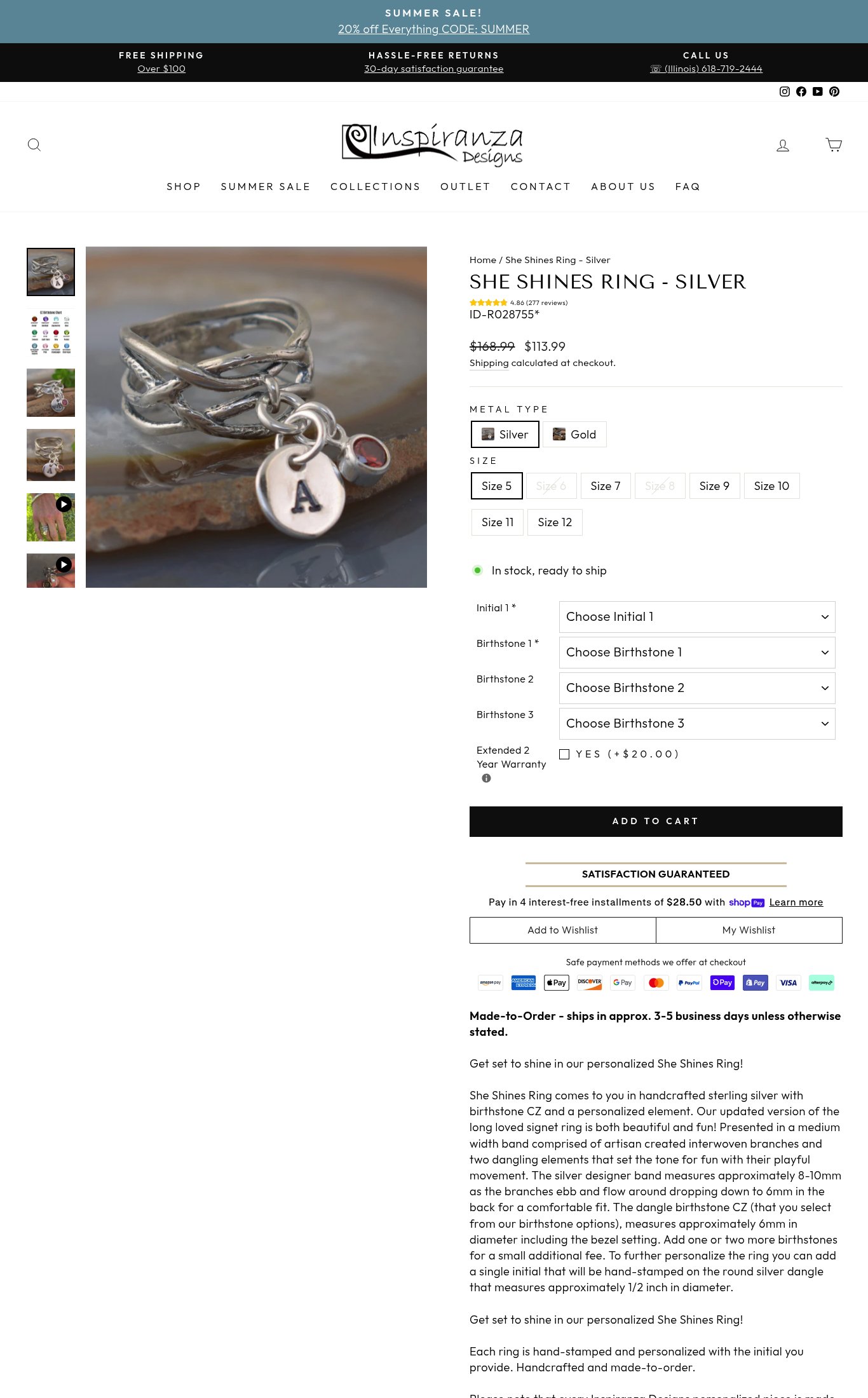
Inspiranza Designs has a competent product page with solid fundamentals — clear pricing, a visible sale promotion, strong review volume at 277 ratings, and out-of-stock variant marking — but it falls short on mobile conversion readiness. The brand's strongest dimension is Clarity, where the product name, price, and discount are all above the fold. The single most critical gap is the absence of a sticky Add to Cart CTA combined with a TBT of 1,220 ms, meaning mobile shoppers must scroll through four personalization dropdowns to reach a button that may feel unresponsive on first tap — a combination that will drive significant abandonment on the brand's highest-traffic channel.
Top Finding
The 'ADD TO CART' button is visible on mobile but is NOT sticky — it appears mid-page and disappears on scroll with no persistent floating CTA bar. The personalization dropdowns (Initial 1, Birthstone 1, Birthstone 2, Birthstone 3) create significant pre-purchase friction with 4 separate selectors before the customer can add to cart. Shipping is listed as 'Shipping calculated at checkout' — no free shipping threshold is shown on the product page itself (desktop header shows 'FREE SHIPPING Over $100' but this is absent on mobile). The 30-day satisfaction guarantee is shown in the header bar but not restated near the CTA. No subscribe & save or bundle offer is present.
purchase friction · high
+7 more findings in the full teardown
Get the full teardown
Score breakdown across all 5 dimensions, every finding, prioritized fix list, and category benchmark position.