Ice Shaker
Kitcheniceshaker.com
Average
out of 100
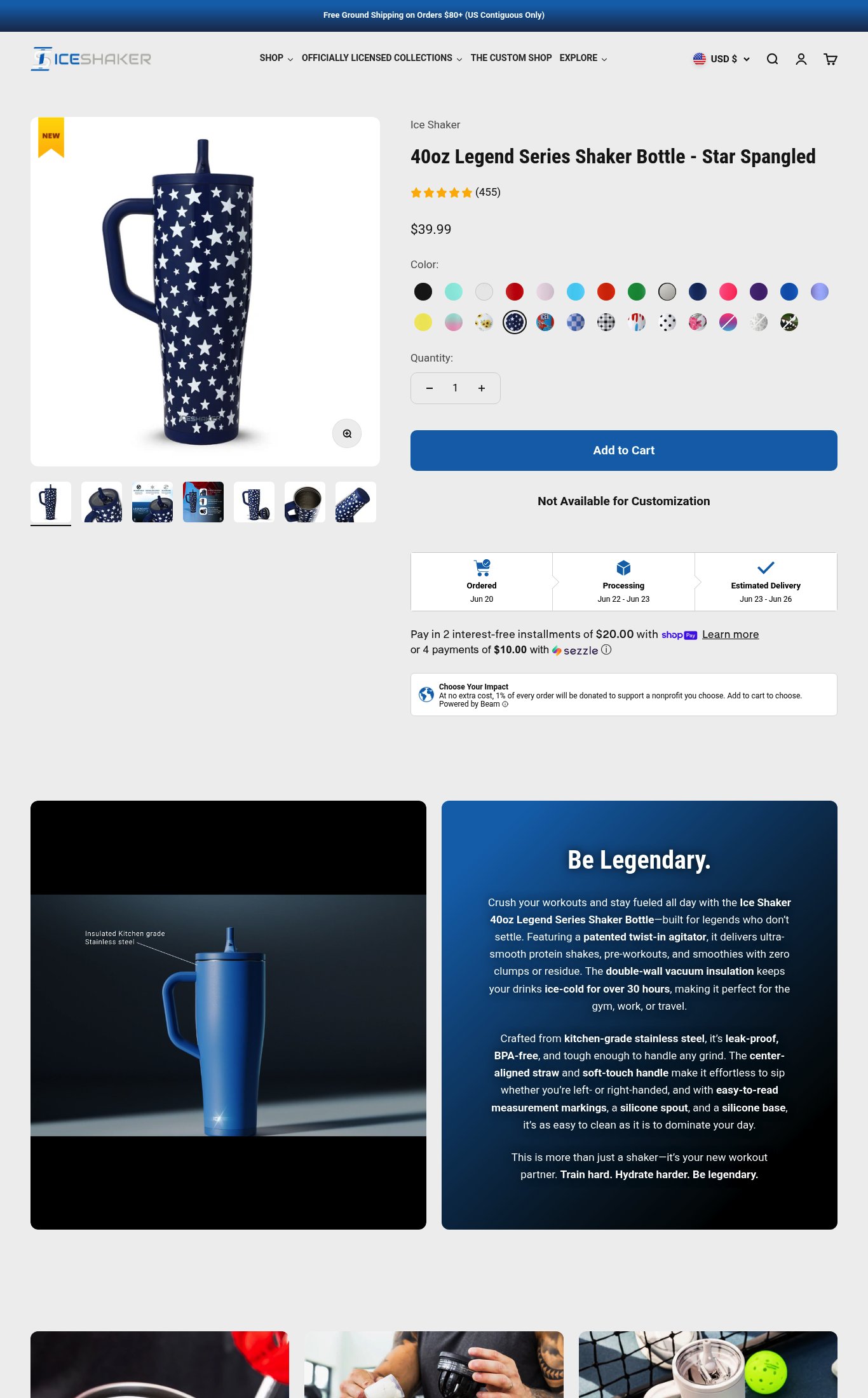
Ice Shaker has a fundamentally sound product page with strong above-the-fold clarity — product name, price, and 455 reviews are all immediately visible on mobile — but three compounding issues suppress conversion: a catastrophic PSI score of 34 that makes cold mobile visitors wait 6+ seconds for the page to respond, a 30+ color swatch grid with no hierarchy that creates decision paralysis, and no return guarantee near the CTA. The brand's strongest dimension is clarity; the single most critical gap is mobile performance, which undermines every other investment in the page.
Top Finding
The color swatch grid shows 30+ color options across 3 rows on mobile, with no visible out-of-stock indicators or grouping logic. This creates decision paralysis — a first-time visitor has no guidance on which variants are popular or available.
purchase friction · high
+13 more findings in the full teardown
Get the full teardown
Score breakdown across all 5 dimensions, every finding, prioritized fix list, and category benchmark position.