HydroJug
Kitchenhydrojug.myshopify.com
Average
out of 100
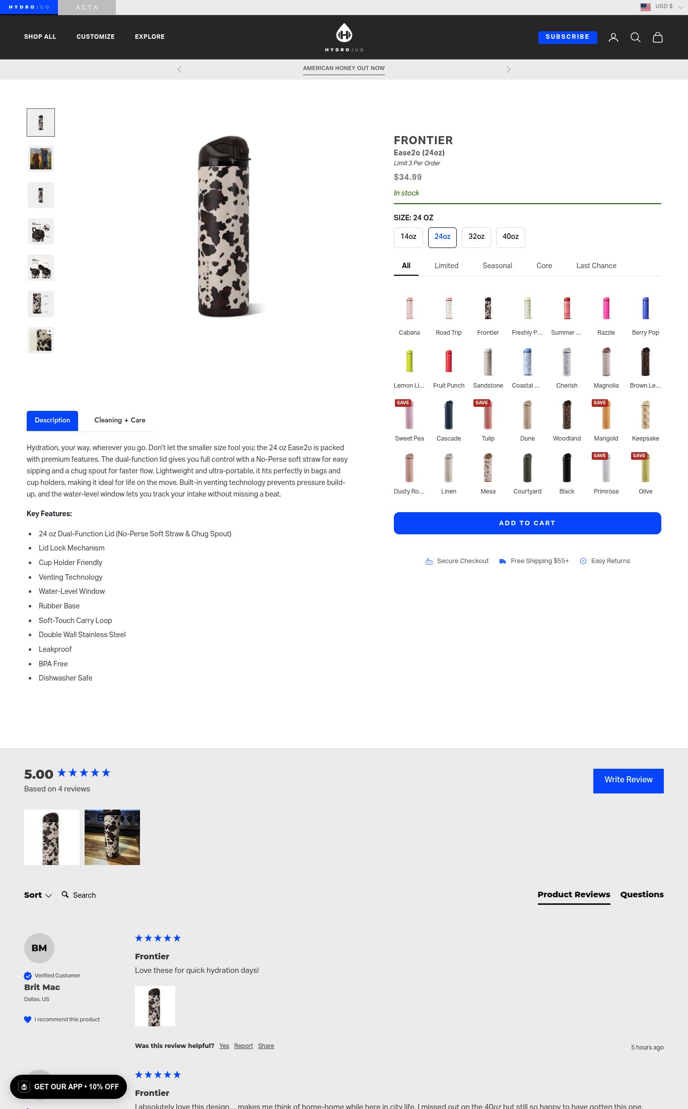
HydroJug's Frontier Ease2o page has a clean mobile layout with a sticky CTA and functional trust bar, but it underperforms where it matters most: there is no value proposition above the fold, the social proof is critically thin (4 reviews, star rating buried below the fold), and the 30+ color swatches create severe decision paralysis on mobile. The page's strongest dimension is purchase friction mechanics (sticky button, trust bar), but the near-6-second LCP and absence of any lifestyle imagery or video mean the page fails to emotionally sell the product before a cold visitor bounces.
Top Finding
No hero value proposition exists — the product name 'FRONTIER Ease2o (24oz)' and price '$34.99' are visible above the fold on mobile, but there is no headline or phrase answering 'why this product, why now.' The description copy 'Hydration, your way, wherever you go' is buried below the fold in a collapsed accordion.
clarity · high
+8 more findings in the full teardown
Get the full teardown
Score breakdown across all 5 dimensions, every finding, prioritized fix list, and category benchmark position.