Heavys
Electronicsheavys.com
Solid
out of 100
Summary
Heavys has a genuinely strong social proof foundation — 4,722 reviews at 4.9 stars displayed near the title, 200,000+ customer claim, and real Instagram UGC are all above average for the electronics category. The page's most critical gap is mobile performance: a 37 PSI score with a 24.9s LCP means a large share of cold mobile visitors will bounce before the page is even interactive, undermining every other conversion element on the page. Fixing core web vitals and adding a sticky mobile CTA would have the highest immediate impact on conversion rate.
AI-Shoppable
92 / 100 · StrongProduct structured data is present and AI crawlers are allowed. 1 of 11 signals still missing.
What’s limiting AI from reading this page
- Ratings in structured data.
AI shopping assistants and answer engines read a page through its structured data and crawler access. Each item above is a reason this page is harder for them to read, understand, or recommend.
Top Fixes
- 1
Fix mobile page speed immediately — an LCP of 24.9s will kill paid traffic ROI. Compress and lazy-load images below the fold, defer non-critical JavaScript, and consider a CDN audit. Getting PSI above 50 should be the single highest-priority technical task.
- 2
Add a sticky 'Add to Cart' bar on mobile scroll — once the user scrolls past the hero CTA into the feature accordions and UGC section, there is no persistent buy button. A bottom-fixed bar with price and CTA would recover lost conversions from engaged but hesitant scrollers.
- 3
Add a hero differentiator headline above or below the product name — something like 'Built for Heavy Music. Engineered to Handle Every Frequency.' The current page leads with a product name and feature blurb; a single bold value-prop line targeting the music-fan identity would sharpen self-selection and justify the $269 price point within 5 seconds.
Findings
PSI mobile score is 37/100 with an LCP of 24.9s and FCP of 4.9s — a cold mobile visitor waits nearly 5 seconds to see any content and 25 seconds for the largest element to load. TBT of 790ms means the page is unresponsive to taps for nearly a full second after load. This is a critical conversion killer for paid traffic.
mobile performance · critical
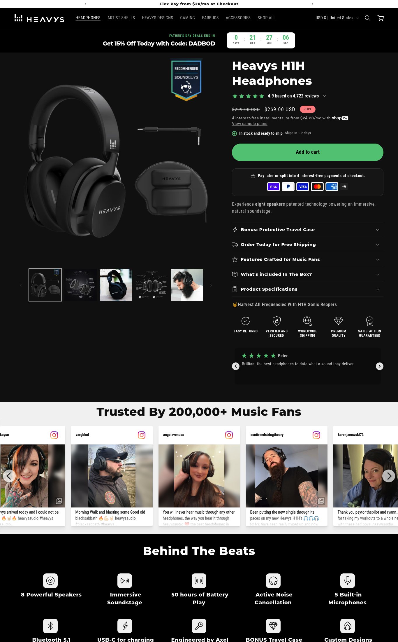
The hero value proposition is weak. The only copy above the fold beyond the product name is 'Experience eight speakers patented technology powering an immersive, natural soundstage' — this is a feature statement buried below the CTA, not a headline answering 'why this, why now.' There is no hero headline on mobile above the fold that differentiates Heavys from Sony or Bose.
clarity · high
Desktop shows 5+ thumbnail images in the gallery carousel (product shot, spec sheet, lifestyle on-person, exploded view, and more), which is strong. However, on mobile only 3 thumbnails are visible in the strip and no video content is present anywhere on the page — a significant missed opportunity for a premium $269 audio product where sound quality is the core claim.
visual merch · high
The 'Add to Cart' CTA is a prominent green button visible above the fold on mobile, but it does not appear to be sticky on scroll — once the user scrolls past it, there is no persistent floating CTA bar visible in the mobile screenshot. For a long-form page this means the user must scroll back up to purchase.
purchase friction · high
Star rating (4.9) and review count (4,722) are visible near the product title on both mobile and desktop — this is well executed. The 'Trusted By 200,000+ Music Fans' section with real Instagram UGC photo carousel (angelavenusx, scottreedstringtheory, etc.) is strong. However, the 'SoundGuys Recommended' badge on the hero image is the only press mention and it is small and easy to miss — no 'As Seen In' bar with named outlets.
social proof · medium
Return policy is listed as 'Easy Returns' in a generic trust badge icon row below the fold, but no specific guarantee copy (e.g., '30-day money-back guarantee') is shown near the CTA. The 'Satisfaction Guaranteed' badge is also generic with no specifics. For a $269 electronics purchase, the absence of a concrete return window near the buy button increases hesitation.
purchase friction · medium
No subscribe-and-save, bundle upsell, or 'frequently bought together' offer is visible on the page. The product is already a bundle (headphones + case), but there is no cross-sell to accessories, artist shells, or earbuds visible on the product page — a missed AOV opportunity.
purchase friction · low
The Father's Day urgency banner ('Get 15% Off Today with Code: DADBOD' + countdown timer) is well-placed and visible above the fold on mobile, and the sale price ($269 vs. $299 with -10% badge) is clearly shown. Price and promotional context are strong above the fold.
clarity · low
Want this done for your brand?
We score your product page from the outside, cold, on mobile, no install.
Request a teardown →