HEATONIST
Food & Beverageheatonist.com
Average
out of 100
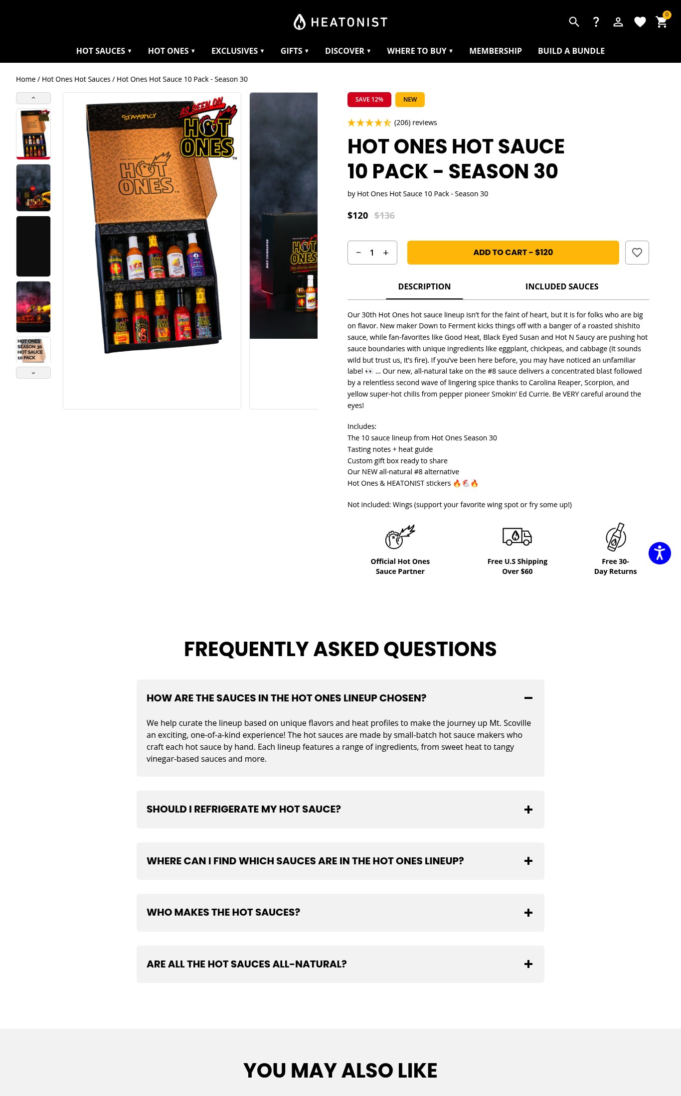
HEATONIST's Season 30 pack page has a clean above-the-fold experience with good clarity — product name, price, discount, and reviews are all immediately visible on mobile — making Clarity its strongest dimension. However, the page is critically undermined by a PSI mobile score of 38 (LCP 19.2s), the absence of a sticky CTA on scroll, no video content despite the product's deep ties to a viral video show, and no press/media social proof to convert cold visitors. Fixing mobile performance and adding a sticky CTA are the two highest-leverage interventions available.
Top Finding
The 'ADD TO CART – $120' button is prominent and visible above the fold on mobile. Trust icons (Official Hot Ones Sauce Partner, Free U.S. Shipping Over $60, Free 30-Day Returns) appear directly below the CTA — shipping and return policy are surfaced near the buy decision. However, the CTA does not appear to be sticky on scroll — once the user scrolls past the product info section into the Description and FAQ, the button disappears with no persistent sticky bar observed.
purchase friction · high
+9 more findings in the full teardown
Get the full teardown
Score breakdown across all 5 dimensions, every finding, prioritized fix list, and category benchmark position.