Harney & Sons Fine Teas
Food & Beverageharney.com
Average
out of 100
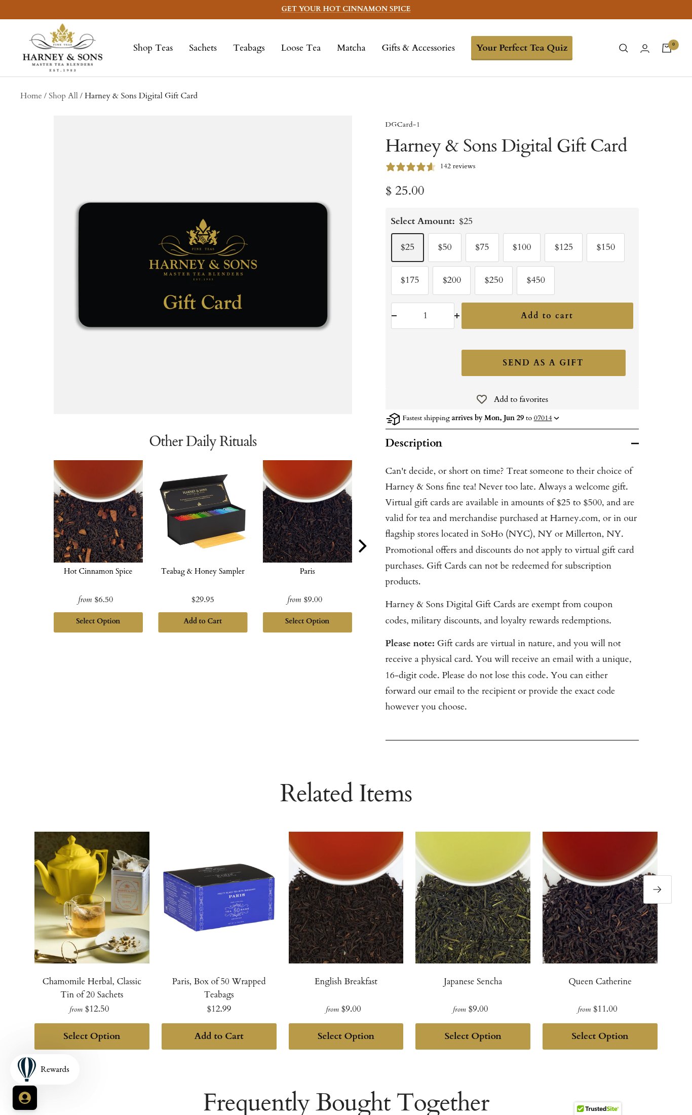
Harney & Sons' digital gift card page is functional and clearly structured, with price, variants, and star ratings all visible above the fold on mobile. The brand's strongest dimension is purchase friction — the variant selector is clean and the CTA is accessible. The single most critical gap is visual merchandising: one flat product image with no lifestyle photography, no video, and no emotional gifting context makes this page fail to sell the feeling of giving tea, which is the entire reason someone buys a gift card.
Top Finding
Only a single image is visible across both mobile and desktop screenshots — a flat, black gift card on a white/dark background. There are no lifestyle images (e.g., someone gifting tea, a tea moment), no contextual shots, and no video. For a gift product, the emotional 'gifting moment' is entirely absent.
visual merch · critical
+7 more findings in the full teardown
Get the full teardown
Score breakdown across all 5 dimensions, every finding, prioritized fix list, and category benchmark position.