GROWNSY
Baby & Kidsgrownsy.com
Average
out of 100
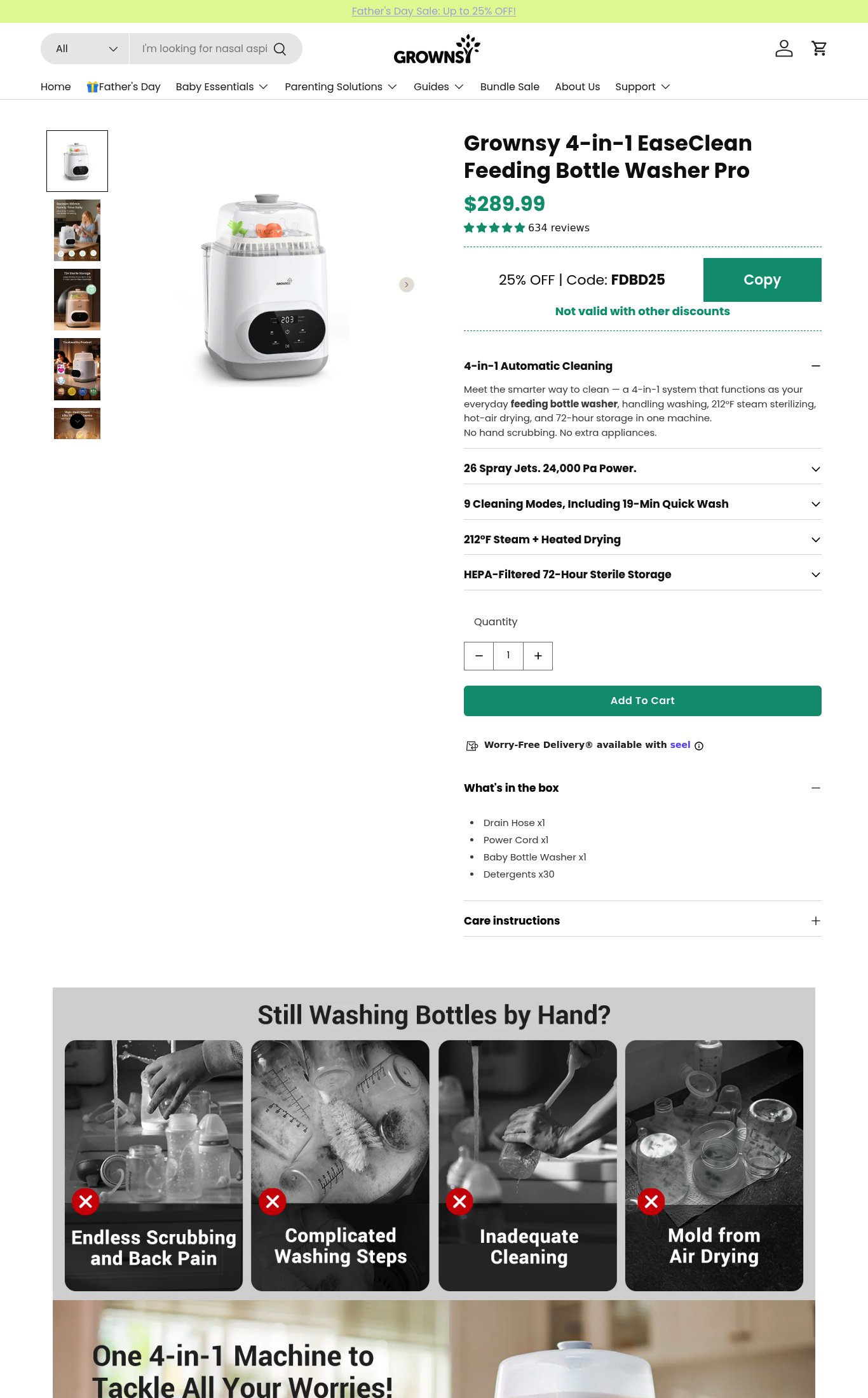
GROWNSY's product page has a solid above-the-fold information structure — product name, price, and 634 reviews are all immediately visible on mobile — but the page underperforms on trust and conversion mechanics for a nearly $300 appliance. The strongest dimension is clarity, where key product details surface quickly. The most critical gap is a combination of a catastrophic PSI score (36/100, 14.3s LCP) that kills cold mobile traffic before the page loads, no sticky CTA on scroll, and no visible return guarantee or press credibility near the buy button.
Top Finding
The 'Add To Cart' button is visible on mobile without scrolling and appears as a full-width green button. However, there is no sticky CTA bar on scroll — once the user scrolls past the product section into the 'Still Washing Bottles by Hand?' content section, the CTA disappears entirely. No persistent bottom bar observed.
purchase friction · high
+11 more findings in the full teardown
Get the full teardown
Score breakdown across all 5 dimensions, every finding, prioritized fix list, and category benchmark position.