Gourmetific
Kitchengourmetific.com
Average
out of 100
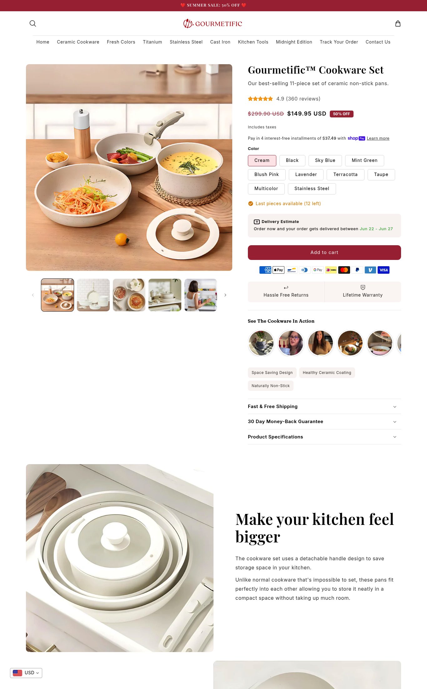
Gourmetific's cookware set page has a solid commercial foundation — clear pricing with a compelling 50% sale, 360 reviews near the fold, delivery estimate, and a wide color variant selection — making Clarity its strongest dimension. However, the page is critically undermined by a PSI mobile score of 36/100 (LCP 50.2s), meaning most cold mobile visitors will never see the page at all. The single most critical gap beyond page speed is the absence of a sticky CTA on mobile scroll, which removes the purchase button from view precisely when customers are reading the most persuasive content.
Top Finding
The 'Add to cart' button is a prominent red/burgundy button visible on mobile without scrolling past the fold, and payment icons (Amex, Apple Pay, Google Pay, Mastercard, Visa, Venmo) are shown directly below it. However, there is no sticky CTA bar observed on scroll — once the user scrolls past the button, it disappears with no persistent bottom bar to recapture intent.
purchase friction · high
+10 more findings in the full teardown
Get the full teardown
Score breakdown across all 5 dimensions, every finding, prioritized fix list, and category benchmark position.