Gorilla Bow
Fitness & Sportsgorillabow.com
Solid
out of 100
Summary
Gorilla Bow Original has a solid foundation: clear product name and sale price above the fold, 991 reviews near the title, and named press coverage that would build real trust — but the page's execution on mobile undermines all of it. The brand's strongest dimension is Clarity, with a readable product name, visible discount, and a functional value prop. The single most critical gap is mobile performance and asset delivery: the PSI score of 52 means cold visitors wait 7+ seconds for content, the press logos render as blank boxes on mobile, and the video asset is invisible — three compounding failures that erode trust and conversion precisely when ad spend is highest.
AI-Shoppable
92 / 100 · StrongProduct structured data is present and AI crawlers are allowed. 1 of 11 signals still missing.
What’s limiting AI from reading this page
- Ratings in structured data.
AI shopping assistants and answer engines read a page through its structured data and crawler access. Each item above is a reason this page is harder for them to read, understand, or recommend.
Top Fixes
- 1
Fix the 'AS SEEN IN' press logo images on mobile — they are rendering as blank grey boxes, wiping out the single strongest third-party credibility signal on the page. Compress and properly lazy-load these assets so they appear on cold mobile loads.
- 2
Implement a sticky 'ADD TO CART' bar that persists as the user scrolls down on mobile — right now the CTA vanishes after the fold and there is no persistent buy button during the feature and description sections.
- 3
Address the 11.2s LCP / 7.5s FCP by optimizing the hero composite image (compress, use next-gen format, preload), deferring non-critical scripts, and ensuring the video asset does not block render — a 52 PSI score is bleeding conversion from every paid click.
Findings
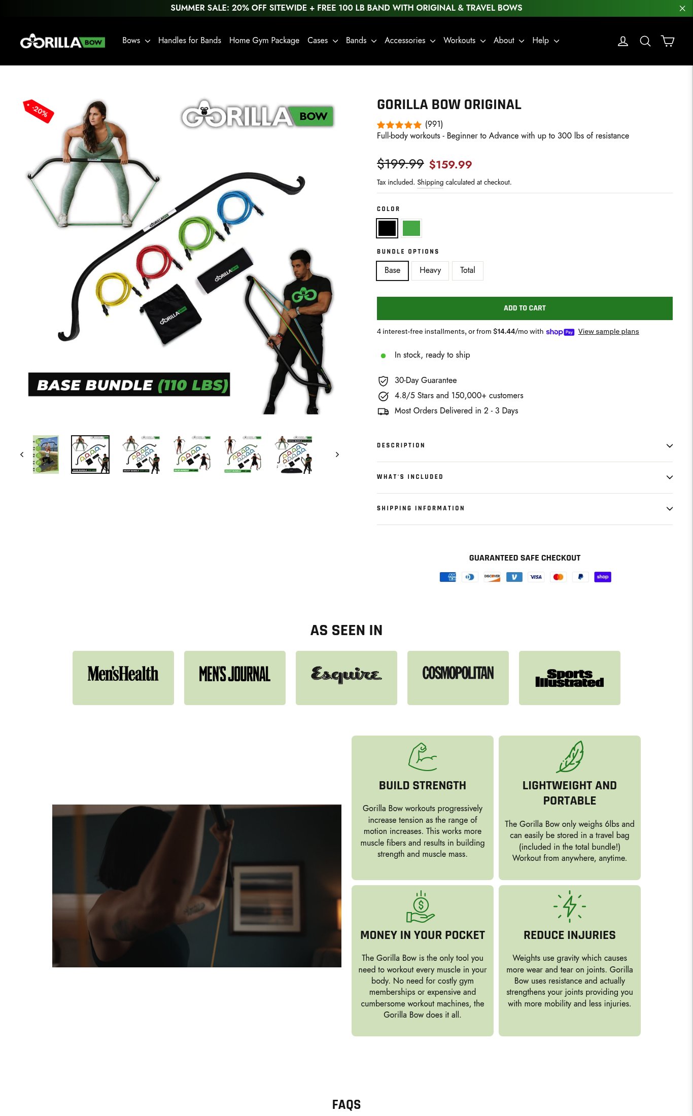
'AS SEEN IN' bar lists Men's Health, Men's Journal, Esquire, Cosmopolitan, and Sports Illustrated on desktop — strong named press. On mobile, the logos render as blank/unloaded grey boxes, completely stripping the credibility signal for cold mobile visitors.
social proof · critical
PSI mobile score is 52/100 with LCP of 11.2s and FCP of 7.5s — both are critically slow for a cold mobile visitor. A first-time user on a typical mobile connection will stare at a blank or partially loaded screen for over 7 seconds before seeing content, which directly kills conversion from paid traffic.
mobile performance · critical
A video asset is visible on desktop (dark lifestyle workout scene below the 'AS SEEN IN' bar) but on mobile it renders as a static dark image with no visible play button or autoplay loop indicator — the video's selling power is effectively lost on mobile.
visual merch · high
The 'ADD TO CART' button is prominent and green above the fold on mobile. However, there is no visible sticky CTA bar on scroll in the mobile screenshot — once the user scrolls past the button into the description and feature sections, the CTA disappears and requires scrolling back up.
purchase friction · high
Product name 'GORILLA BOW ORIGINAL' is visible above the fold on mobile, price shows clear sale ($199.99 → $159.99), and the sub-headline 'Full-body workouts - Beginner to Advance with up to 300 lbs of resistance' functions as a value prop. However, the hero headline is a feature statement, not a benefit-led hook — it doesn't answer 'why this over a gym membership or dumbbells' in an emotionally compelling way.
clarity · medium
Star rating (5 stars) and review count (991) are visible directly below the product title on both mobile and desktop — strong placement near the fold. The '4.8/5 Stars and 150,000+ customers' trust badge below the CTA reinforces volume. However, no customer photo reviews or UGC are visible anywhere in the screenshots.
social proof · medium
Shipping information is collapsed behind an accordion ('SHIPPING INFORMATION') rather than surfaced inline. The '2-3 Days' delivery estimate appears as a trust badge icon but free shipping threshold or exact cost is not visible without tapping the accordion. No explicit money-back guarantee copy near the CTA — '30-Day Guarantee' appears as a small icon badge but lacks detail (30-day what? Returns? Full refund?).
purchase friction · medium
Desktop thumbnail strip shows 7+ images including lifestyle shots of a person using the bow with resistance bands, product flat-lay, and bundle contents. On mobile the hero image is a composite product shot with a lifestyle figure — functional but the swipe gallery experience is not clearly signaled (no dot indicators visible in the mobile screenshot).
visual merch · low
CTA copy reads 'ADD TO CART' — the baseline generic copy. No specificity like 'Build My Bundle' or 'Get the Gorilla Bow' that reinforces the product identity or urgency from the summer sale banner.
clarity · low
No subscribe & save toggle, no 'frequently bought together' module, and no bundle upsell beyond the three bundle tier options (Base/Heavy/Total) already in the variant selector. A cross-sell or subscription option is entirely absent.
purchase friction · medium
Want this done for your brand?
We score your product page from the outside, cold, on mobile, no install.
Request a teardown →