Glossier
Beautyglossier.com
Average
out of 100
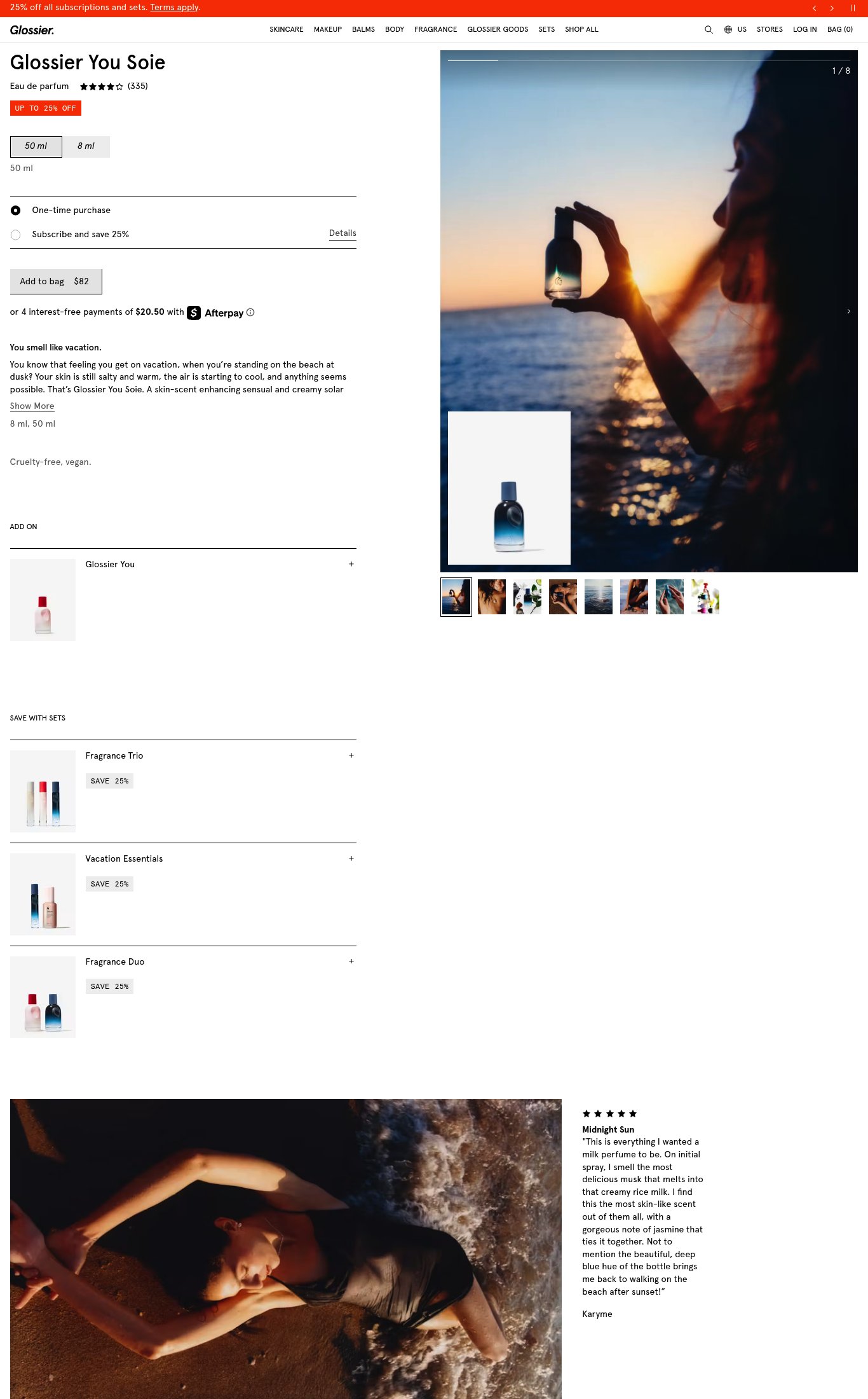
Glossier You Soie is a well-structured product page with strong above-the-fold clarity, a rich 8-image gallery with genuine lifestyle photography, and a smart subscription/bundle upsell architecture. Its strongest dimension is visual merchandising — the sunset beach imagery effectively communicates the fragrance's mood. The single most critical gap is the absence of a sticky Add to Cart button on mobile scroll combined with thin social proof (no photo reviews, no press mentions) near the CTA, which creates meaningful hesitation for a first-time visitor being asked to spend $82 on a scent they cannot smell.
Top Finding
The 'Add to bag $82' CTA is visible above the fold on mobile and appears as a full-width dark button. However, there is no evidence of a sticky CTA bar on scroll — once the user scrolls past the buy box into the description and bundles section, the button disappears from view.
purchase friction · high
+10 more findings in the full teardown
Get the full teardown
Score breakdown across all 5 dimensions, every finding, prioritized fix list, and category benchmark position.