Gayo
Apparelgayoshop.com
Average
out of 100
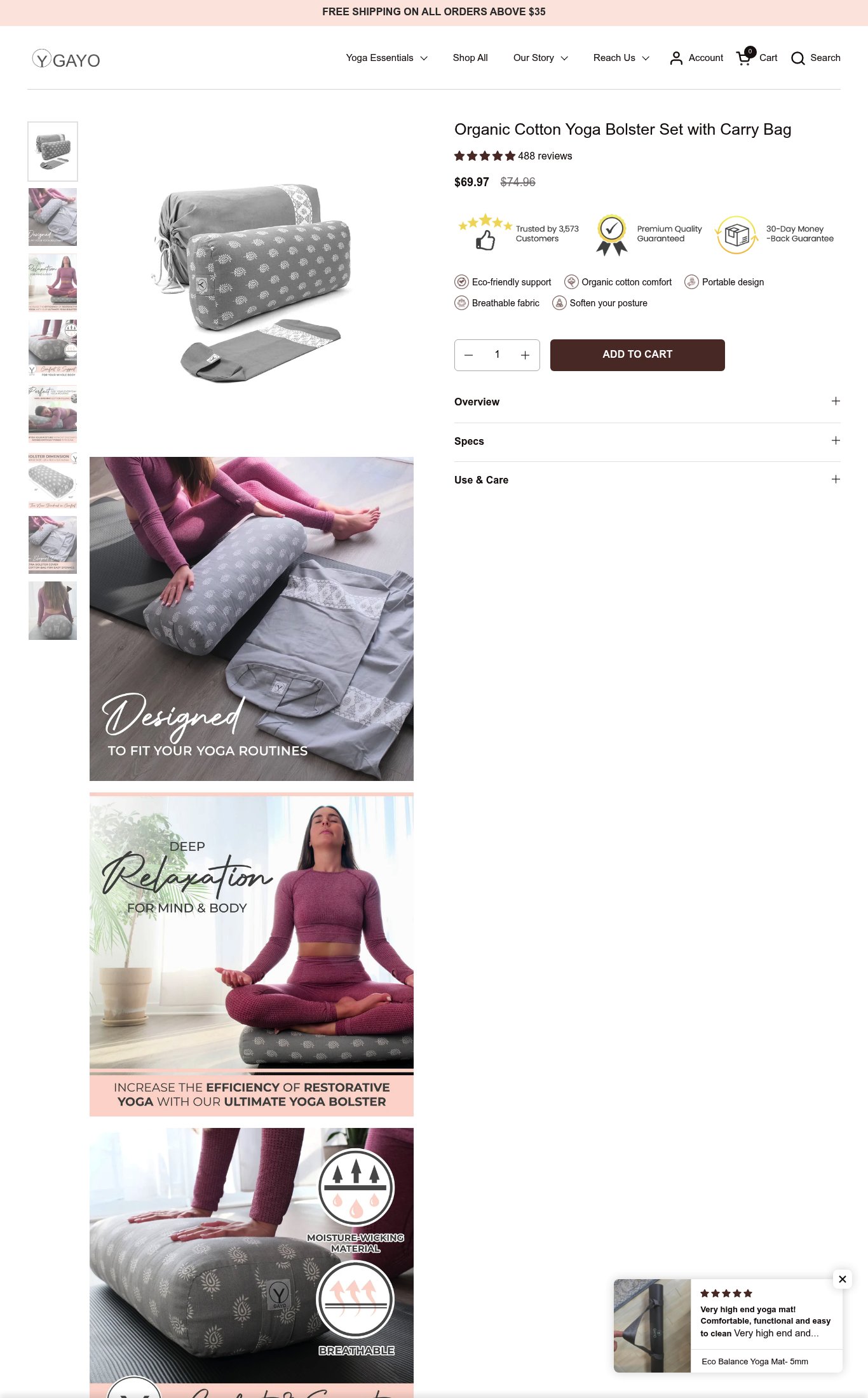
Gayo's yoga bolster page has a solid foundation: clear product naming, visible pricing, a decent review count near the fold, and good lifestyle imagery variety. The brand's strongest dimension is clarity — the product name, price, and key trust badges are all above the fold on mobile. The single most critical gap is mobile performance, with a 22.6-second LCP that will cause most cold mobile visitors to abandon before the page even loads, compounded by the absence of a sticky CTA that would otherwise help convert the visitors who do stay.
Top Finding
The 'ADD TO CART' button is visible on mobile but does not appear to be sticky on scroll — below the fold, the page shows only accordion sections (Overview, Specs, Use & Care) and long-form copy with no persistent CTA button visible in the lower mobile screenshots.
purchase friction · high
+12 more findings in the full teardown
Get the full teardown
Score breakdown across all 5 dimensions, every finding, prioritized fix list, and category benchmark position.