Fresh Clean Threads
Apparelfreshcleantees.com
Solid
out of 100
Summary
Fresh Clean Threads has a well-structured product page with exceptional social proof volume (18,957 reviews), clear pricing with savings callout, and solid shipping transparency — these are genuine conversion strengths. The page's biggest gap is purchase friction: a full-screen quiz modal fires on cold load, the CTA copy is generic ('Select options'), and there is no sticky button to keep the purchase path accessible during scroll. Closing these three friction points would meaningfully lift conversion without requiring any new content creation.
AI-Shoppable
32 / 100 · WeakNo Product structured data found — AI shopping agents and answer engines can't reliably read this page's name, price, or availability, so it's unlikely to be surfaced as a recommendation.
Why AI can’t read this page
- Product structured data (JSON-LD). No Product schema — AI agents can't parse the product
- Price in structured data.
- Availability in structured data.
- Ratings in structured data.
- Brand in structured data.
- Image in structured data.
- Description in structured data.
- SKU / GTIN identifier.
AI shopping assistants and answer engines read a page through its structured data and crawler access. Each item above is a reason this page is harder for them to read, understand, or recommend.
Top Fixes
- 1
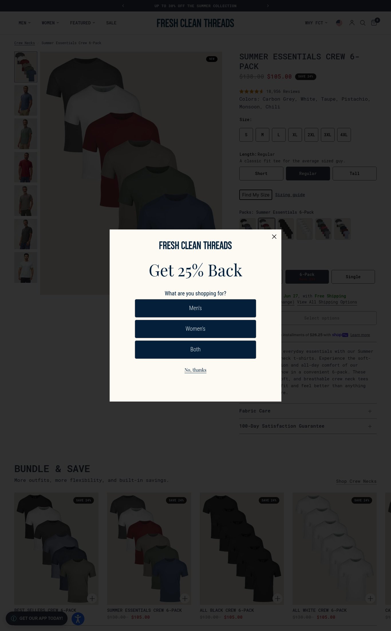
Remove or delay the 'Get 25% Back' quiz modal — firing a full-screen interstitial on cold page load interrupts product evaluation before trust is established. Trigger it on exit-intent or after 30 seconds instead.
- 2
Add a sticky 'Add to Bag' or 'Get My 6-Pack' floating CTA button on mobile scroll so the purchase action is always one tap away — the current inline 'Select options' button disappears as users scroll through descriptions and size guides.
- 3
Surface the 100-Day Satisfaction Guarantee as a visible icon/badge directly adjacent to the CTA button rather than a collapsed accordion below the fold — and add customer photo reviews or a UGC carousel to the page to close the visual trust gap.
Findings
The desktop screenshot shows a full-screen 'Get 25% Back — What are you shopping for?' quiz modal firing on page load. While the mobile screenshot does not show it, this interstitial interrupts the purchase flow for cold visitors and adds a friction step before they can even evaluate the product.
purchase friction · high
No customer photo reviews or UGC are visible on the product page in either screenshot. No 'As Seen In' press bar or named media mentions appear anywhere on the page. These are meaningful trust gaps for a brand at this price point.
social proof · high
The CTA button on mobile reads 'Select options' and is not sticky — it appears inline below the variant selectors with no persistent floating button visible on scroll. A cold visitor scrolling through the description has no always-visible path to purchase.
purchase friction · high
No video content is visible anywhere on the page — no autoplay loop, no embedded video, no video thumbnail. For a multi-pack apparel product, a short fit/fabric video would meaningfully reduce purchase hesitation.
visual merch · high
CTA reads 'Select options' rather than something action-oriented like 'Build My Pack' or 'Add to Bag'. This generic copy undersells the bundle value and creates ambiguity about what happens next.
clarity · medium
No hero value proposition headline exists — the page jumps straight to product name and price. There is no sentence answering 'why this 6-pack, why now' above the fold. The body copy ('Stock up on your everyday essentials...') is buried below the CTA.
clarity · medium
'100-Day Satisfaction Guarantee' is visible as a collapsed accordion near the bottom of the mobile page — it is below the CTA and requires a tap to expand. The guarantee copy is not surfaced near the 'Select options' button where it would reduce hesitation at the moment of decision.
purchase friction · medium
PSI mobile score is 81/100 (LCP 3.9s, FCP 3.5s, CLS 0, TBT 0ms). LCP and FCP are both above 3s which is noticeable on cold load, but CLS and TBT are excellent — no layout shift or blocking time.
mobile performance · medium
Product name 'SUMMER ESSENTIALS CREW 6-PACK' is clearly visible above the fold on mobile, price shows $138.00 struck through with $105.00 and a 'SAVE 24%' badge — all readable without scrolling. Strong clarity fundamentals.
clarity · low
Pack size upsell (Single / 6-Pack / 10-Pack Save $55) is present and clearly laid out on mobile. Shop Pay installments ($26.25 x 4) are shown below the CTA. Bundle & Save section visible on desktop. Upsell and payment flexibility are well-executed.
purchase friction · low
Desktop thumbnail rail shows 7+ images including lifestyle shots of men wearing the tees in outdoor/casual settings. Mobile swipe gallery shows at least 4 visible thumbnails (group flat lay + 3 lifestyle). Image count and variety are strong.
visual merch · low
Star rating (4.5 stars) and review count (18,957 Reviews) are displayed directly below the price on mobile — excellent placement near the fold. Review volume of 18,957 earns maximum points for volume credibility.
social proof · low
Shipping clarity is solid: 'Get it by Sat, Jun 27, with Free Shipping — Ship to: 07014' is shown directly above the CTA on mobile. Delivery date and free shipping are both visible without scrolling past the fold.
purchase friction · low
On mobile, the 'Select options' CTA button is positioned in the lower half of the screen and appears reachable in the thumb zone. Body text (product description, size labels, variant copy) is legible at normal viewing distance with adequate contrast and font size.
mobile performance · low
Want this done for your brand?
We score your product page from the outside, cold, on mobile, no install.
Request a teardown →