Fièra Cosmetics
Beautyfieracosmetics.com
Solid
out of 100
Summary
Fièra's Total Skin Renewal System page is a well-structured, conversion-aware page with strong clarity fundamentals — product name, price, value prop, and 3,889 reviews are all above the fold on mobile. Social proof via named press logos (Vogue, People, InStyle) and verified buyer reviews is a clear strength. The two most critical gaps are a missing sticky CTA (users lose the buy button on scroll with no recovery mechanism) and a 7.3-second mobile LCP that is likely bleeding a meaningful share of cold paid traffic before the page even loads.
AI-Shoppable
94 / 100 · StrongProduct structured data is present and AI crawlers are allowed. 1 of 11 signals still missing.
What’s limiting AI from reading this page
- SKU / GTIN identifier.
AI shopping assistants and answer engines read a page through its structured data and crawler access. Each item above is a reason this page is harder for them to read, understand, or recommend.
Top Fixes
- 1
Implement a sticky 'Add to Cart' bar on mobile scroll — the current CTA disappears as users scroll through press logos and ingredient lists, and there is no persistent anchor to recover intent.
- 2
Add photo/video reviews to the on-page review section and introduce at least one autoplay video (tutorial, before/after, or UGC reel) — for a $107 anti-aging bundle, visual proof of results is the single most persuasive trust lever missing from this page.
- 3
Reduce LCP from 7.3 s by lazy-loading below-fold images, preloading the hero image, and compressing the product flat-lay — a 7-second load on cold mobile is losing a significant share of paid traffic before the page even renders.
Findings
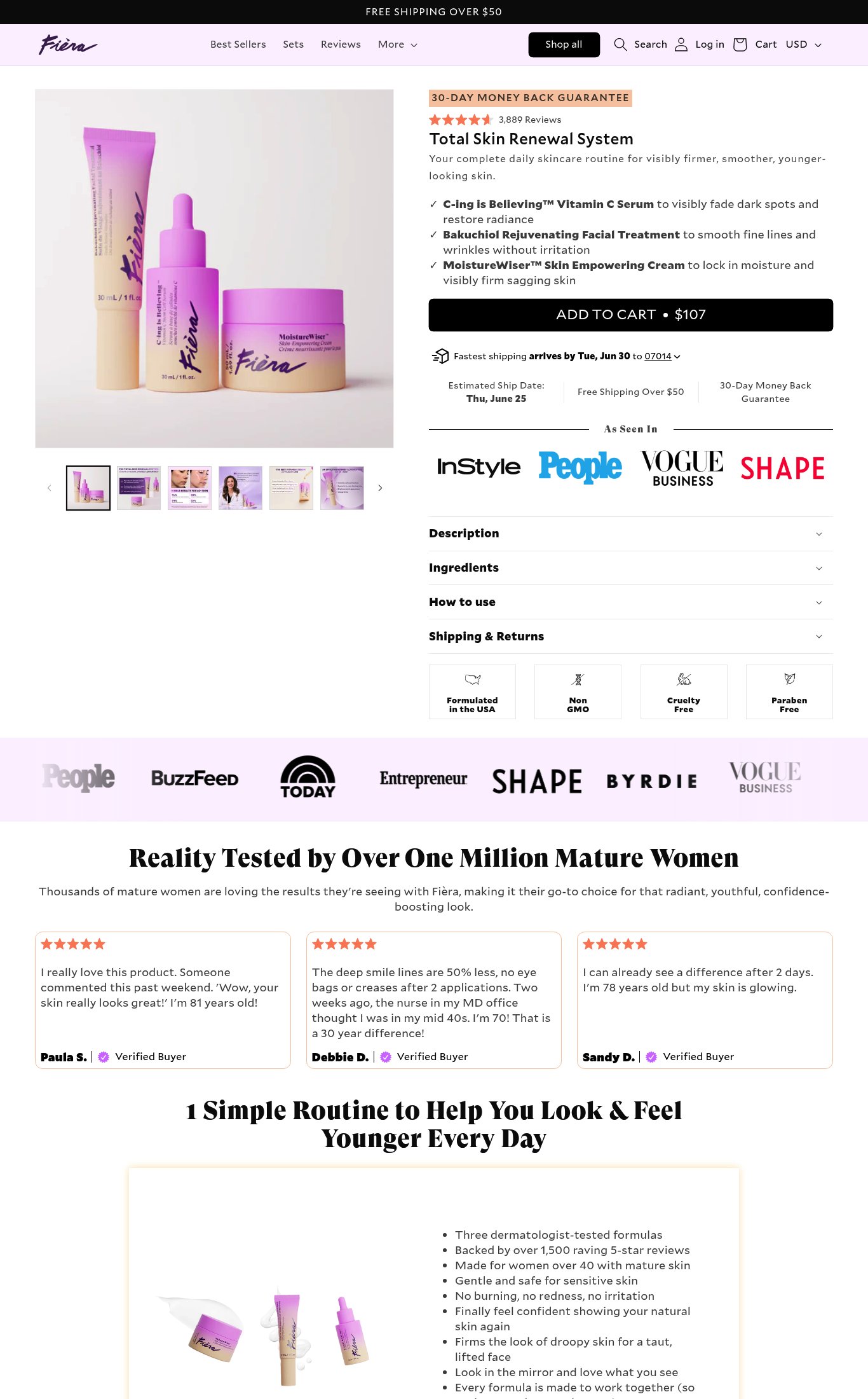
The 'ADD TO CART • $107' button is large and dark on mobile, but there is no evidence of a sticky/persistent CTA bar on scroll. A cold visitor scrolling through the ingredient checklist and press logos loses the CTA from view with no persistent anchor.
purchase friction · high
PSI mobile score is 52/100 with LCP of 7.3 s and TBT of 490 ms. A 7.3-second largest contentful paint means the hero product image — the first thing a cold mobile visitor needs to see — loads extremely slowly, directly harming first impressions and bounce rate.
mobile performance · critical
Customer reviews shown below the fold are text-only with verified buyer badges — no photo reviews or UGC imagery are visible in the screenshots. For a beauty product where visual results are the core promise, photo reviews would significantly lift credibility.
social proof · high
Desktop thumbnail strip shows 6+ images including lifestyle/on-model shots; mobile shows 4 visible thumbnails with a carousel arrow indicating more. Image count qualifies for full marks, but no video content (autoplay loop, embedded video, or video thumbnail) is visible anywhere on the page.
visual merch · high
The hero image on mobile is a product-only flat-lay on a light background — no model or in-use context above the fold. Lifestyle imagery (woman applying product, before/after) appears only below the fold. For a $107 anti-aging bundle targeting mature women, an above-the-fold lifestyle shot would do more selling work.
visual merch · medium
No subscribe-and-save toggle, bundle upsell, or 'frequently bought together' module is visible anywhere on the page. At $107 for a 3-product system, a subscription option could reduce perceived price risk and improve LTV simultaneously.
purchase friction · medium
Shipping clarity is strong: 'Fastest shipping arrives by Tue, Jun 30 to 07014', estimated ship date (Thu, June 25), and 'Free Shipping Over $50' are all shown directly below the CTA on mobile. The $107 bundle clears the free shipping threshold automatically, which should be called out explicitly ('Free shipping included').
purchase friction · low
Product name 'Total Skin Renewal System', price ($107 embedded in CTA), and a concise value prop — 'Your complete daily skincare routine for visibly firmer, smoother, younger-looking skin' — are all visible above the fold on mobile without scrolling. The 30-Day Money Back Guarantee badge also appears above the fold, reinforcing confidence immediately.
clarity · low
Press bar includes InStyle, People, Vogue Business, and SHAPE near the CTA on mobile, and a second expanded bar (People, BuzzFeed, TODAY, Entrepreneur, Shape, Byrdie, Vogue Business) below the fold. Named, recognizable press logos are a strong trust signal for a cold visitor.
social proof · low
CTA copy reads 'ADD TO CART • $107' — price-in-button is a strong pattern but 'Add to Cart' is still generic. A more specific verb like 'Get My System' or 'Start My Routine' would better match the aspirational framing of the page.
clarity · low
Star rating (4.5 stars) and review count (3,889 Reviews) are displayed directly below the 30-Day Guarantee badge and above the product name — highly visible near the fold on both mobile and desktop. This is best-practice placement.
social proof · low
Want this done for your brand?
We score your product page from the outside, cold, on mobile, no install.
Request a teardown →