Fair Harbor
Apparelfairharborclothing.com
Average
out of 100
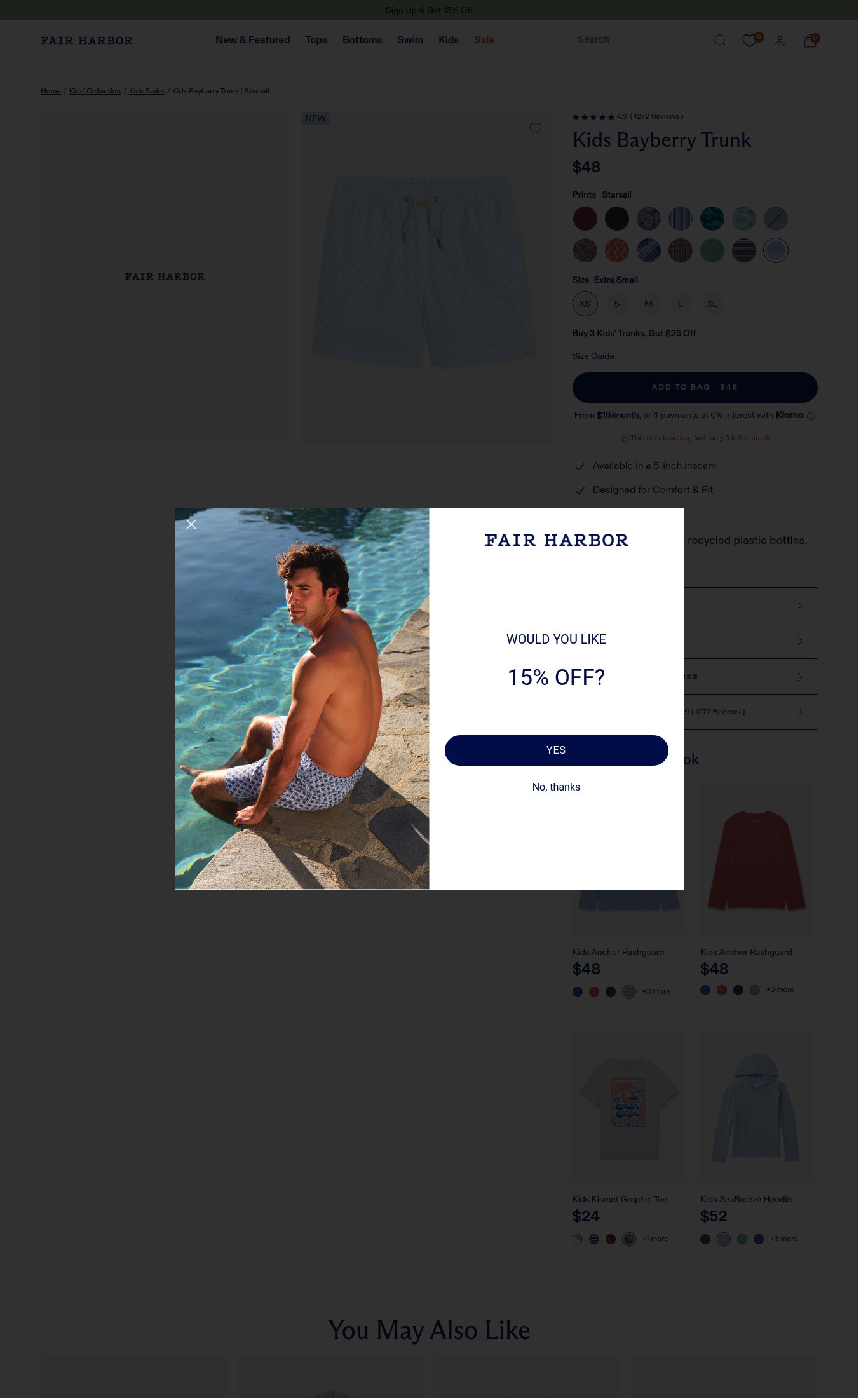
Fair Harbor's Kids Bayberry Trunk page has a strong foundation in clarity — product name, price, and 1,272 reviews are all above the fold on mobile — and the variant selection UX is genuinely well-executed. However, the page is critically undermined by a near-total absence of lifestyle/contextual imagery on mobile (a single white-background product shot), no sticky CTA on scroll, and a catastrophic PSI mobile score of 34 with a 37-second LCP that will bleed cold traffic before the page even renders. The single most critical gap is mobile page speed, which makes every other conversion optimization irrelevant for a large share of first-time visitors.
Top Finding
On mobile, only a single product-on-white-background image is visible above the fold with a single dot indicator suggesting minimal additional images. No lifestyle imagery (child wearing the trunk at the beach/pool) is visible in the mobile screenshot. The desktop screenshot shows a lifestyle image of an adult male in swim trunks in the email-capture modal, but no kids lifestyle shot is surfaced in the product gallery itself.
visual merch · critical
+12 more findings in the full teardown
Get the full teardown
Score breakdown across all 5 dimensions, every finding, prioritized fix list, and category benchmark position.