COOLA
Beautycoola.com
Average
out of 100
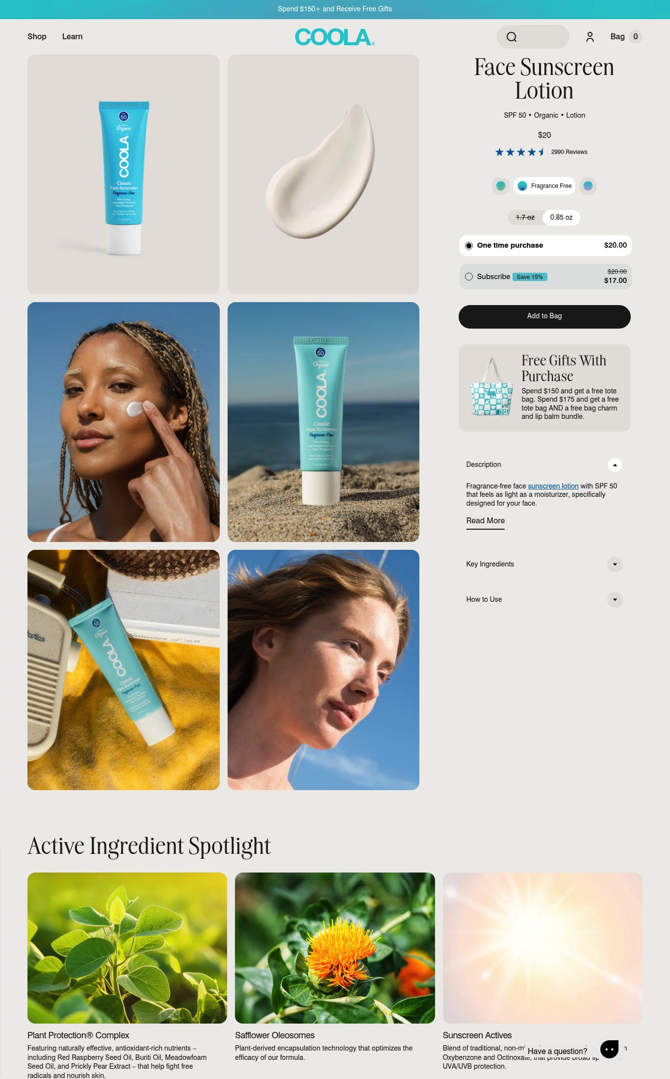
COOLA's product page has a solid structural foundation — clear pricing, a well-executed subscribe-and-save toggle, strong review volume, and good lifestyle imagery on desktop — but it underperforms on the signals that close cold mobile visitors. The single most critical gap is a catastrophic mobile load time (LCP 36.9s) that will cause most cold visitors to bounce before they ever see the product, compounded by a missing sticky CTA and no risk-reversal copy near the buy button.
Top Finding
The 'Add to Bag' CTA is visible above the fold on mobile and appears as a full-width black button, which is dominant. However, there is no sticky CTA bar visible on scroll in the mobile screenshot — once the user scrolls past the button into the description and ingredient sections, the CTA disappears.
purchase friction · high
+9 more findings in the full teardown
Get the full teardown
Score breakdown across all 5 dimensions, every finding, prioritized fix list, and category benchmark position.