Chill-N-Reel
Kitchenchillnreel.com
Solid
out of 100
Summary
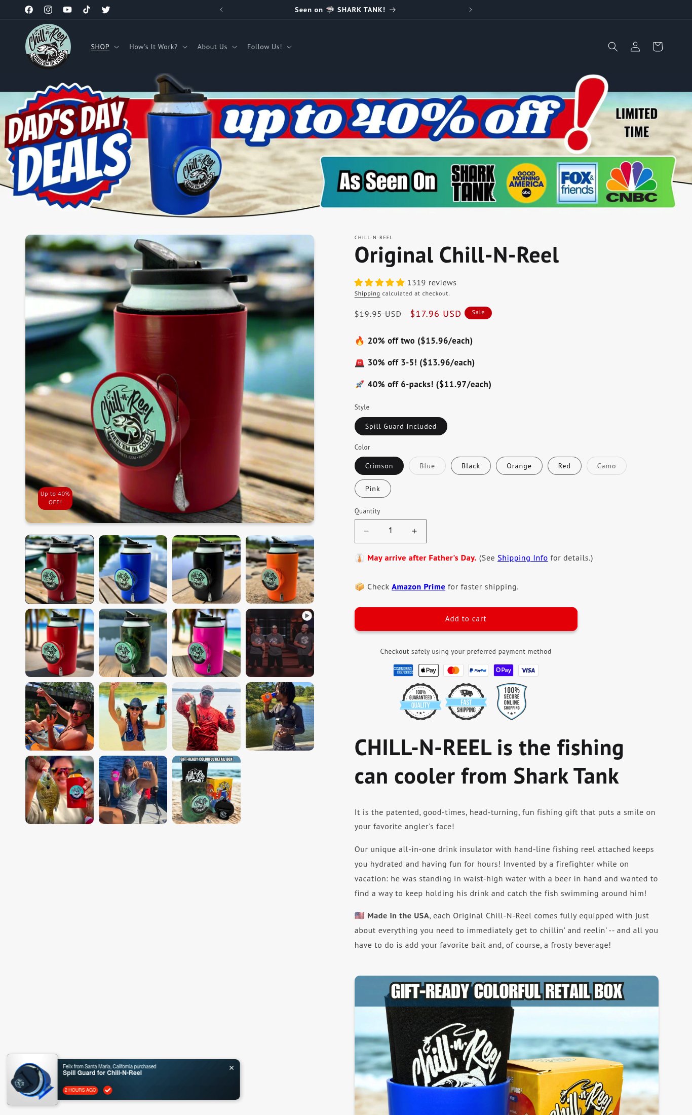
Chill-N-Reel has a genuinely strong product page foundation: 1,319 reviews above the fold, named press logos (Shark Tank, GMA, CNBC), 15 lifestyle images, and clear volume discount tiers all work in its favor. Social proof is the standout dimension. The single most critical gap is a 9.4-second mobile LCP combined with no free shipping signal on the page — together these two friction points are likely costing the brand a meaningful share of paid traffic conversions before a visitor even reaches the CTA.
AI-Shoppable
92 / 100 · StrongProduct structured data is present and AI crawlers are allowed. 1 of 11 signals still missing.
What’s limiting AI from reading this page
- Ratings in structured data.
AI shopping assistants and answer engines read a page through its structured data and crawler access. Each item above is a reason this page is harder for them to read, understand, or recommend.
Top Fixes
- 1
Add a free shipping threshold or flat-rate delivery estimate directly on the product page (e.g., 'Free shipping on orders over $35') — 'calculated at checkout' is a known cart abandonment trigger, especially on mobile where users are less patient.
- 2
Embed the Shark Tank pitch clip or a short product demo video in the gallery — this is the single highest-credibility asset the brand owns and it is completely absent from the page, which is a major missed conversion lever.
- 3
Improve mobile page speed to reduce the 9.4s LCP: compress and lazy-load below-fold images, defer non-critical JavaScript, and consider a lighter hero image format (WebP) — over half of cold mobile visitors will bounce before the page fully loads at current speeds.
Findings
Shipping is listed as 'calculated at checkout' with no free shipping threshold or delivery estimate on the product page itself. The only shipping signal is a warning that the order 'May arrive after Father's Day' with a link to Shipping Info — this creates anxiety rather than confidence. No free shipping threshold is stated anywhere visible on the page.
purchase friction · high
PSI mobile score is 53/100 with LCP of 9.4 seconds — a first-time mobile visitor on a cold load waits nearly 10 seconds to see the main product image. TBT of 450 ms indicates significant main-thread blocking. This directly harms conversion for paid traffic landing on this page.
mobile performance · critical
No video content is visible on the page in either screenshot — no autoplay loop, embedded video, or video thumbnail. For a Shark Tank product where the pitch clip would be highly persuasive, the absence of video is a missed conversion opportunity.
visual merch · high
The 'Add to cart' button is a full-width red button on mobile and appears to be sticky (visible in the lower portion of the mobile screenshot), which is good. However, there is no visible return policy or money-back guarantee near the CTA — the three badge icons below the button include '100% Guaranteed Quality' and '100% Secure Online Shopping' but the guarantee terms are not spelled out (e.g., '30-day money-back guarantee'), reducing their persuasive value.
purchase friction · medium
Product name 'Original Chill-N-Reel' is clearly visible above the fold on mobile, price is shown ($17.96 USD with strikethrough $19.95 USD and a 'Sale' badge), and the Shark Tank headline 'CHILL-N-REEL is the fishing can cooler from Shark Tank' appears below the fold — not above it. The above-fold area lacks a punchy value proposition sentence; the hero image and discount banner do most of the work but don't answer 'why this product' in a single line.
clarity · medium
The 'As Seen On' bar prominently names Shark Tank, Good Morning America, Fox & Friends, and CNBC with logos — this is high-credibility press proof displayed near the top of the page. However, photo reviews or UGC are not visible in either screenshot; only text-based review indicators appear near the title, and no customer photo review section is shown above the fold.
social proof · medium
Bundle/volume discount tiers are clearly shown (20% off two, 30% off 3-5, 40% off 6-packs) with per-unit pricing — this is an effective upsell mechanism. However, there is no Subscribe & Save toggle or 'Frequently Bought Together' section visible, leaving recurring revenue on the table.
purchase friction · low
CTA copy reads 'Add to cart' — the baseline generic phrasing. A more specific CTA like 'Grab Mine' or 'Get the Chill-N-Reel' would reinforce the product identity and urgency, especially given the Father's Day sale context already established in the announcement bar.
clarity · low
Desktop thumbnail grid shows 15 images (counter reads '1/15' on mobile), including lifestyle shots of people fishing and using the product outdoors — strong image volume. However, on mobile the gallery is a single swipe carousel and the first image is a product-on-dock shot that is partially clipped on the right edge, suggesting the second image is peeking but not fully visible.
visual merch · low
Star rating (5 filled stars) and '1319 reviews' count are visible directly below the product title on both mobile and desktop — well above the fold. This is executed correctly and provides strong immediate trust.
social proof · low
Want this done for your brand?
We score your product page from the outside, cold, on mobile, no install.
Request a teardown →