Ceremonia
Beautyceremonia.com
Solid
out of 100
Summary
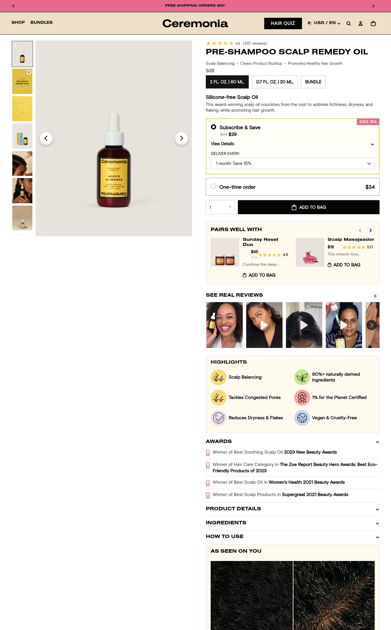
Ceremonia's Aceite de Moska page is a well-structured beauty PDP with genuinely strong social proof — 337 reviews at 4.8 stars, prominent UGC video reviews, and four named press awards all visible without heavy scrolling. The Subscribe & Save upsell and bundle cross-sell are cleanly executed. The single most critical gap is mobile performance: a PSI score of 46 with a 7.3 s LCP means a large share of cold mobile visitors will bounce before the page renders, undermining every other conversion element on the page.
AI-Shoppable
100 / 100 · StrongProduct structured data is present and AI crawlers are allowed. 0 of 11 signals still missing.
Top Fixes
- 1
Fix mobile page speed urgently — LCP of 7.3 s and FCP of 4.6 s will cause significant bounce before the page even loads. Audit and defer non-critical JavaScript (TBT 460 ms suggests heavy third-party scripts), lazy-load below-fold images, and serve next-gen image formats for the hero product shot.
- 2
Add a sticky 'ADD TO BAG' button that persists as the user scrolls through the long product page on mobile — right now the CTA disappears once the user moves into the highlights, awards, and review sections, forcing them to scroll back up to buy.
- 3
Surface the free shipping threshold ($50+) and a return/guarantee statement directly inside the purchase block on mobile — a single line like 'Free shipping over $50 · 30-day returns' placed just above or below the ADD TO BAG button removes two common objections at the exact moment of decision.
Findings
PSI mobile score is 46/100 — below the 50-point threshold, earning 0 pts on the PSI component. LCP of 7.3 s and FCP of 4.6 s are critically slow for a cold mobile visitor; a first-time user on a mid-range device will see a blank or partially loaded page for over 4 seconds before any content appears. TBT of 460 ms indicates significant main-thread blocking that delays interactivity.
mobile performance · critical
The 'ADD TO BAG' button is large, full-width, and black on mobile — dominant and easy to tap. However, it does not appear to be a sticky/persistent CTA on scroll. Once the user scrolls past the purchase block, there is no floating button keeping the CTA in the thumb zone throughout the long page.
purchase friction · high
Shipping clarity is weak on the product page itself. The desktop announcement bar reads 'FREE SHIPPING ORDERS $50+' but on mobile the announcement bar shows 'LIMITED-EDITION GUAVA SUMMER MYSTERY BOX' — the free shipping threshold is not surfaced near the CTA or in the purchase block on mobile, creating uncertainty at the moment of decision.
purchase friction · medium
No return policy or money-back guarantee is visible near the CTA on either mobile or desktop. The purchase block shows Subscribe & Save pricing and a one-time order option but no reassurance copy (e.g., '30-day returns' or 'satisfaction guaranteed') adjacent to the buy button.
purchase friction · medium
Desktop thumbnail rail shows 7 images including lifestyle shots (woman applying oil, product lineup, close-up texture). Mobile carousel has 8 dot indicators visible. Image count clears the 5+ threshold. However, the hero image on mobile is a plain white-background product shot — the lifestyle imagery is buried deeper in the carousel, meaning the first impression is clinical rather than aspirational.
visual merch · medium
Product name 'PRE-SHAMPOO SCALP REMEDY OIL' is bold and visible above the fold on mobile, immediately below the star rating. Price ($34 one-time / $29 subscribe) is also visible without scrolling. The sub-headline 'Silicone-Free Scalp Oil' plus the three benefit bullets (Scalp Balancing · Clears Product Buildup · Promotes Healthy Hair Growth) do solid value-prop work. However, there is no single punchy hero headline answering 'why now' — the product name doubles as the headline, which is functional but not emotionally compelling.
clarity · low
CTA copy reads 'ADD TO BAG' — a slight step above the generic 'Add to Cart' baseline but still category-generic for a beauty brand. A more specific line like 'Start My Scalp Reset' or 'Get Healthy Hair' would score higher and reinforce the benefit at the moment of decision.
clarity · low
A 'SEE REAL REVIEWS' UGC video strip is visible on both mobile and desktop — multiple video thumbnails with play buttons showing real customers using the product. This is strong visual social proof and counts as video content on the page.
visual merch · low
Star rating (4.8) and review count (337 reviews) appear directly below the product name on both mobile and desktop — well above the fold. 337 reviews earns the 100–999 tier (3 pts). The 'SEE REAL REVIEWS' photo/video UGC strip is prominent and includes multiple customer video reviews. Four named press awards are listed (New Beauty Awards 2023, The Zoe Report, Women's Health 2021, Supergreat 2021) — these are specific, credible publications that go well beyond generic trust badges.
social proof · low
Subscribe & Save toggle is prominently featured with a 'SAVE 15%' badge and a delivery frequency dropdown — this is a well-executed subscription upsell. A 'PAIRS WELL WITH' bundle section (Sunday Reset Duo at $65) also appears directly below the CTA, adding cross-sell value without cluttering the primary purchase decision.
purchase friction · low
Want this done for your brand?
We score your product page from the outside, cold, on mobile, no install.
Request a teardown →