Caldera + Lab
Beautycalderalab.com
Solid
out of 100
Summary
Caldera + Lab's product page for The Good has genuinely strong bones: clear above-the-fold messaging, a well-structured subscription module, 2,500+ reviews near the title, and a 60-day guarantee near the CTA. The brand's strongest dimension is Clarity — the product, price, target customer, and value prop are all communicated efficiently on mobile. The single most critical gap is mobile performance: a 22.4-second LCP means the majority of cold mobile visitors will never see any of those strengths, and the page scores 47/100 on PSI, which alone caps conversion potential severely.
AI-Shoppable
32 / 100 · WeakNo Product structured data found — AI shopping agents and answer engines can't reliably read this page's name, price, or availability, so it's unlikely to be surfaced as a recommendation.
Why AI can’t read this page
- Product structured data (JSON-LD). No Product schema — AI agents can't parse the product
- Price in structured data.
- Availability in structured data.
- Ratings in structured data.
- Brand in structured data.
- Image in structured data.
- Description in structured data.
- SKU / GTIN identifier.
AI shopping assistants and answer engines read a page through its structured data and crawler access. Each item above is a reason this page is harder for them to read, understand, or recommend.
Top Fixes
- 1
Fix the catastrophic mobile load time: LCP of 22.4s will kill conversion before the page is seen. Prioritize lazy-loading below-fold assets, compress the hero image, and implement a CDN or preload hint for the hero product shot — this is the single highest-ROI fix on the page.
- 2
Investigate and fix the review count rendering bug visible on desktop ('[0]' shown instead of '2565') — if this affects any real visitor sessions, it destroys social proof at the most critical trust moment near the product title.
- 3
Add a press/media bar ('As Seen In' with named outlets like GQ, Men's Health, or Forbes) and surface at least one row of photo reviews above the fold or immediately below the CTA — a $110 serum targeting 50+ buyers needs third-party credibility signals, not just brand-reported clinical stats.
Findings
PSI mobile score is 47/100 with an LCP of 22.4 seconds and FCP of 4.4 seconds. A 22-second largest contentful paint means the hero product image is loading far too late for a cold first-time mobile visitor — most will bounce before the page is usable.
mobile performance · critical
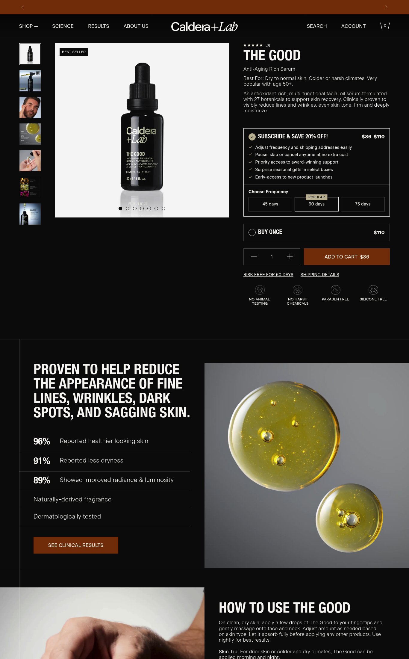
Star rating (5 stars) and review count [2565] are visible near the product title on mobile — this is strong placement. However, on the desktop screenshot the review count renders as '[0]', suggesting a possible rendering/loading bug where the review count fails to populate on initial load for some visitors.
social proof · high
Desktop thumbnail rail shows 7 images including a lifestyle shot of a man applying the product, a close-up of the oil droplets, and ingredient imagery. On mobile the carousel dots indicate 5+ images and a thumbnail strip is visible. Image count qualifies for full marks. However, no autoplay video loop or embedded video is visible in either screenshot — a significant missed opportunity for a premium $110 serum.
visual merch · high
No customer photo reviews or UGC are visible anywhere in either screenshot. No 'As Seen In' press bar, named media mentions (e.g. GQ, Forbes, Men's Health), or third-party certification badges appear on the page. The clinical stats (96%, 91%, 89%) are brand-reported, not third-party press, and do not substitute for named press logos.
social proof · high
The primary hero image on mobile is a clean white-background product shot. While the thumbnail strip shows lifestyle imagery, the first impression is a studio shot rather than the product in use on skin, which reduces emotional pull for a skincare product targeting 50+ consumers.
visual merch · medium
'RISK FREE FOR 60 DAYS' is shown as a text link directly below the Add to Cart button on mobile, and 'SHIPPING DETAILS' is also linked inline. The 60-day risk-free guarantee is near the CTA which is good, but it renders as a small underlined text link rather than a badge or icon treatment — easy to miss on a quick scroll.
purchase friction · medium
Product name 'THE GOOD', subtitle 'Anti-Aging Rich Serum', price ($86 subscribe / $110 buy once), and the 'Best For: Dry to normal skin. Colder or harsh climates. Very popular with age 50+.' qualifier are all visible above the fold on mobile without scrolling. This is strong above-the-fold clarity.
clarity · low
The CTA reads 'ADD TO CART $86' — it includes the price, which is functional, but the copy is generic. No action-oriented language like 'Start My Routine' or 'Get The Good' that would reinforce the brand voice or urgency.
clarity · low
The Subscribe & Save toggle with frequency selector (45/60/75 days) and the Buy Once option are clearly presented with pricing ($86 vs $110). The subscription default is pre-selected and the 20% savings is prominent. This is a well-executed upsell/subscription module.
purchase friction · low
Want this done for your brand?
We score your product page from the outside, cold, on mobile, no install.
Request a teardown →