BRANWYN | Performance Innerwear
Outdoorbranwyn.com
Solid
out of 100
Summary
BRANWYN's Essential Bralette page is a technically excellent, well-structured product page that earns a Solid 79/100 — anchored by a near-perfect PSI score of 95, strong review volume (3,375 reviews visible near the fold), and good lifestyle imagery. The brand's strongest dimension is Mobile Performance, with zero blocking render time and fast load. The single most critical gap is the cold-load email capture modal, which fires immediately on mobile and physically obscures the Add to Cart button and size selectors, creating unnecessary friction at the exact moment a first-time visitor is evaluating the product.
AI-Shoppable
100 / 100 · StrongProduct structured data is present and AI crawlers are allowed. 0 of 11 signals still missing.
Top Fixes
- 1
Delay or soften the email capture modal — trigger it on exit-intent or after 30 seconds rather than on cold load. The modal currently buries the Add to Cart button and size selectors on mobile, directly blocking purchase intent from first-time visitors.
- 2
Surface the OEKO-TEX, Woolmark, RWS, and ZQ certification logos as visual trust badges directly beneath the Add to Cart button — these are powerful credibility signals for the outdoor/performance category that are currently hidden in the description text.
- 3
Add a short (15–30 second) autoplay video loop showing the bralette in motion — running, yoga, or everyday wear — to demonstrate the stretch, seamless construction, and convertible strap feature that text alone cannot convey.
Findings
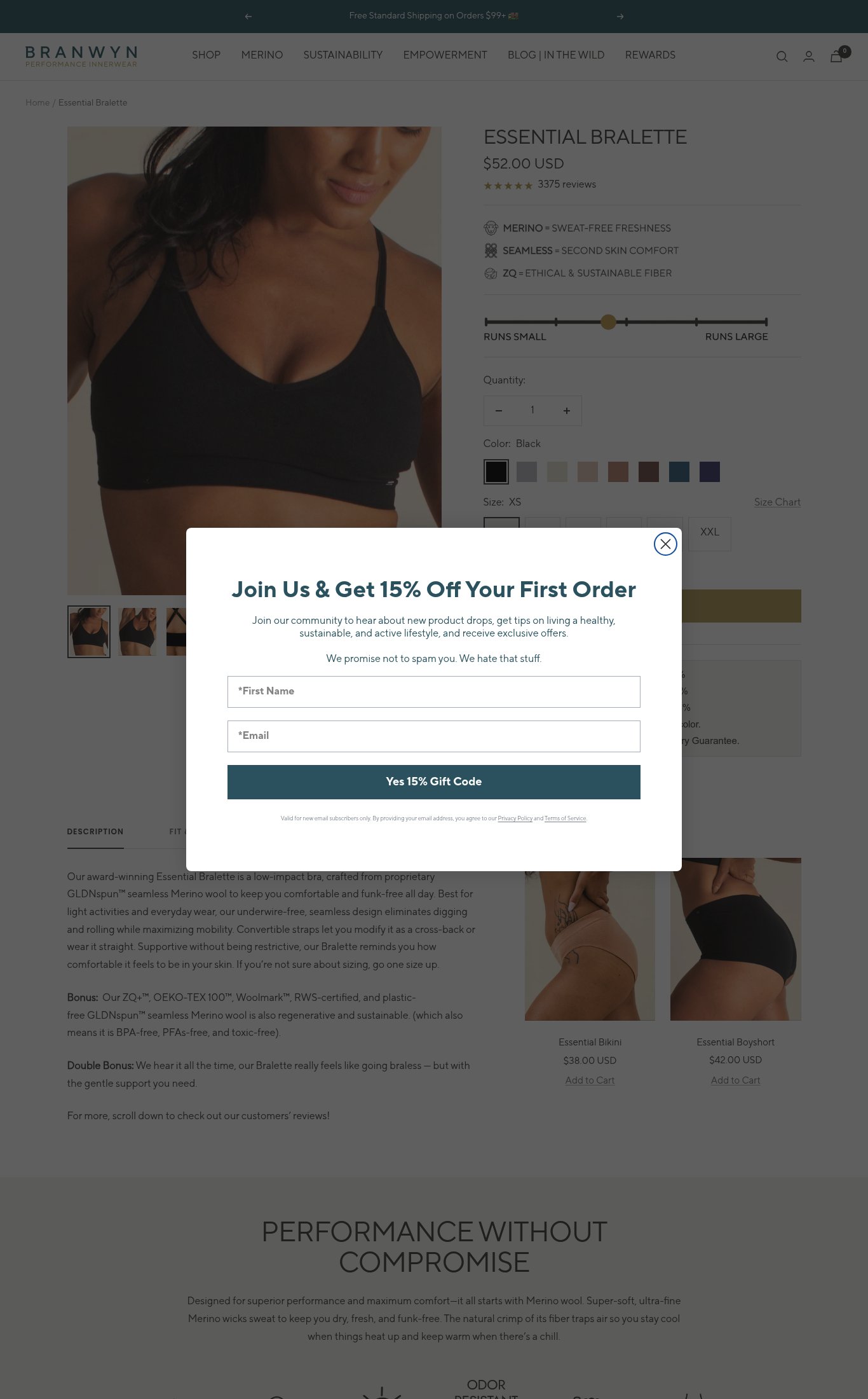
A full-screen email capture modal ('Join Us & Get 15% Off Your First Order') fires on cold load on both mobile and desktop, requiring two form fields (First Name, Email) before the visitor can interact with the page. The Add to Cart button and size selectors are completely obscured behind the modal on mobile.
purchase friction · high
Bundle savings (Bundle 2 | SAVE 5%, Bundle 3 | SAVE 10%, Bundle 4+ | SAVE 15%) and a 'Complete the Set' cross-sell (Essential Bikini $38, Essential Boyshort $42) are both present on the page — solid upsell architecture. A size fit slider ('RUNS SMALL → RUNS LARGE') and a Size Chart link on desktop reduce sizing anxiety. Shipping threshold ('Free Standard Shipping on Orders $99+') is in the announcement bar. However, no return policy or money-back guarantee is visible near the Add to Cart button on mobile.
purchase friction · medium
No press mentions, 'As Seen In' bar, or named certification badges (e.g., Woolmark, OEKO-TEX) are visible above the fold. The description text mentions ZO+™, OEKO-TEX 100™, Woolmark™, and RWS certifications but these are buried in the description tab, not surfaced as trust badges near the CTA.
social proof · medium
Product name 'ESSENTIAL BRALETTE' and price '$52.00 USD' are both visible above the fold on mobile after dismissing the modal. Three icon-driven benefit lines (MERINO = SWEAT-FREE FRESHNESS, SEAMLESS = SECOND SKIN COMFORT, ZQ = ETHICAL & SUSTAINABLE FIBER) serve as a functional value proposition, though there is no single hero headline answering 'why this, why now' beyond the product name.
clarity · medium
No video content is visible anywhere on the page — no autoplay loop, embedded video, or video thumbnail. For a performance innerwear product where fit, stretch, and movement are key selling points, the absence of video is a missed opportunity.
visual merch · medium
Star rating (5 stars visually) and '3375 reviews' count are displayed directly below the price on mobile — strong placement near the fold. Review volume of 3,375 earns maximum points. However, no customer photo reviews or UGC are visible above the fold or in the immediately scrollable area on mobile.
social proof · medium
CTA copy reads 'ADD TO CART' — the baseline generic copy. No specificity like 'Get My Bralette' or 'Add to Bag' that would reinforce brand voice or urgency.
clarity · low
Five thumbnail images are visible in the mobile carousel (lifestyle on-body shots in multiple angles plus a back-strap detail), and the desktop confirms at least 5 images. All are lifestyle/on-model shots — no sterile white-background-only images. Mobile images appear full-width and swipe-friendly.
visual merch · low
PSI mobile score of 95/100 with LCP 2.4s, FCP 2.4s, CLS 0.001, and TBT 0ms — exceptional technical performance. Add to Cart button is in the thumb zone on mobile after scrolling past the size selector. Body text in the description is legible at normal viewing distance with adequate contrast.
mobile performance · low
Want this done for your brand?
We score your product page from the outside, cold, on mobile, no install.
Request a teardown →