BariatricPal Store
Food & Beveragestore.bariatricpal.com
Solid
out of 100
Summary
BariatricPal's multivitamin page is functionally solid — strong review volume, clear variant selection, a Subscribe & Save toggle, and price-inclusive CTA all reduce purchase friction effectively. The page's strongest dimension is purchase friction, with well-structured variant pickers and a prominent sticky CTA. The single most critical gap is the complete absence of photo reviews or UGC near the CTA, combined with certifications buried in body copy — for a post-surgery supplement buyer who is highly risk-averse, visual social proof and visible trust credentials at the point of purchase are non-negotiable conversion drivers.
AI-Shoppable
100 / 100 · StrongProduct structured data is present and AI crawlers are allowed. 0 of 11 signals still missing.
Top Fixes
- 1
Add photo reviews and UGC from real bariatric patients directly on the product page — the 3,045 reviews exist but no customer photos are surfaced; a photo review carousel near the CTA would dramatically increase trust for a health-anxious buyer.
- 2
Surface the cGMP and NSF/ANSI Standard 173 certifications as visual trust badges near the 'ADD TO CART' button rather than burying them in body text — post-surgery patients are highly ingredient-conscious and certification badges at the point of purchase reduce hesitation.
- 3
Reduce LCP from 5.0s by lazy-loading below-fold images, compressing the hero product image, and deferring non-critical scripts — a 5-second load on cold mobile is losing a meaningful share of first-time visitors before they even see the product.
Findings
No customer photo reviews or UGC are visible anywhere in the screenshots. The page shows text-based FAQ accordion items but no photo review gallery. For a health supplement, visual social proof from real patients is a major trust driver that is entirely absent above the fold.
social proof · high
No video content is present anywhere on the page — no autoplay loop, no embedded video, no video thumbnail. For a supplement targeting a health-anxious post-surgery audience, a short explainer or testimonial video would significantly increase trust and dwell time.
visual merch · high
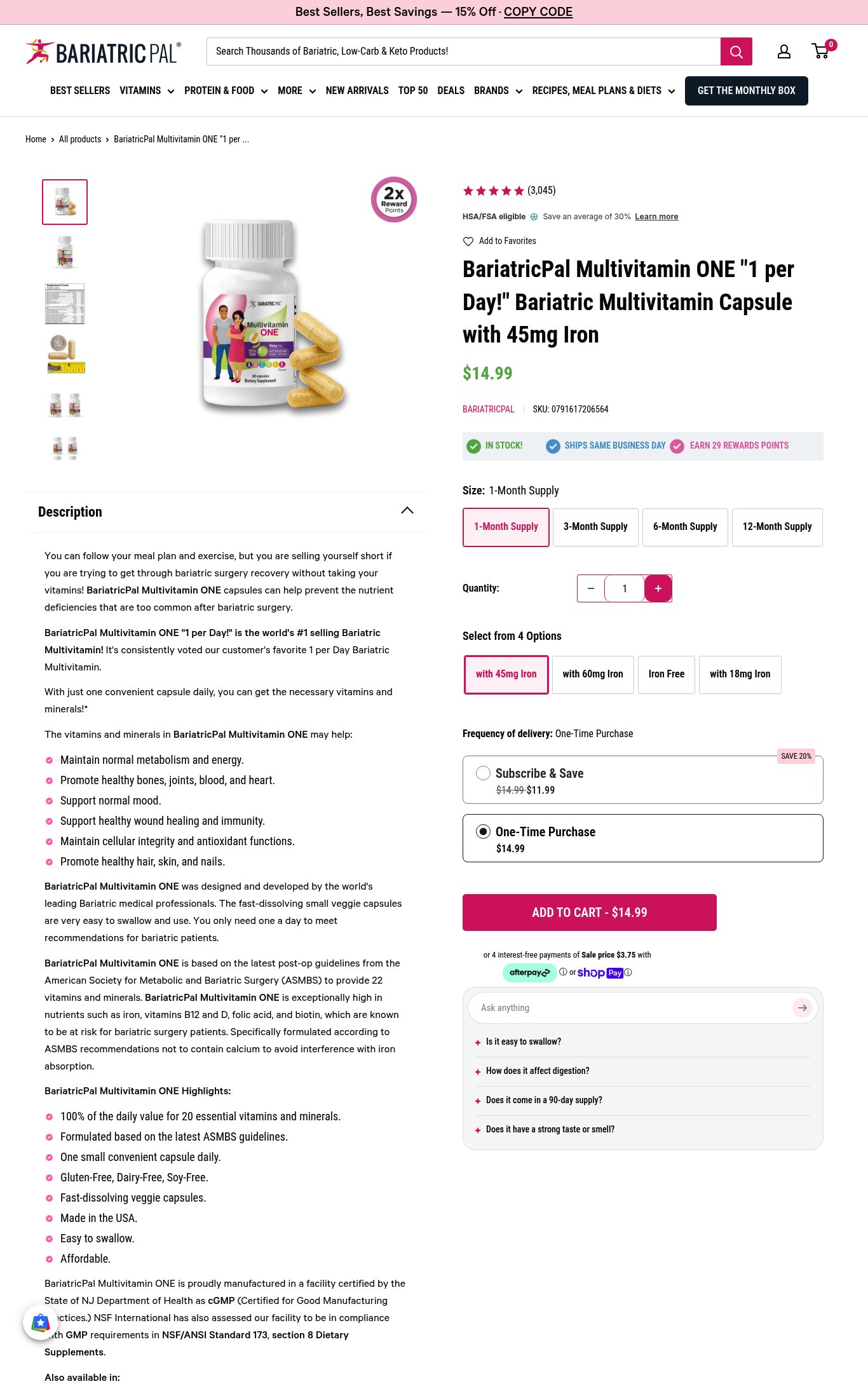
Product name 'BariatricPal Multivitamin ONE "1 per Day!" Bariatric Multivitamin Capsule with 45mg Iron' and price '$14.99' are both visible above the fold on mobile, but the product name is extremely long and wraps across 3 lines, reducing scannability. No punchy hero headline or value proposition exists — the name does the heavy lifting but reads like a SKU label, not a benefit statement.
clarity · medium
PSI mobile score is 74/100 with LCP of 5.0s and FCP of 3.5s. The 5-second LCP is notably slow for a product page — a cold first-time visitor on mobile will wait over 5 seconds to see the main product image fully rendered, which risks significant bounce. TBT of 100ms and CLS of 0 are acceptable.
mobile performance · high
Six thumbnail images are visible in the mobile carousel (product bottle, lifestyle shot with couple, supplement facts panel, comparison/variant shots), meeting the 5+ image threshold. However, the hero image on mobile is a white-background product shot with a small lifestyle graphic embedded on the bottle label — not a true lifestyle image showing the product in use by a real bariatric patient.
visual merch · medium
No press mentions, 'As Seen In' bar, or named certification badges are visible. The desktop description mentions cGMP certification and NSF/ANSI Standard 173 compliance, but these are buried in body text far below the fold — not displayed as trust badges near the CTA. 'HSA/FSA eligible' is shown near the title which is a mild trust signal but not a press or certification badge.
social proof · medium
The 'ADD TO CART - $14.99' button is large, full-width, and pink/prominent on mobile. A Subscribe & Save option at $11.99 (saving 20%) is clearly presented with a toggle above the CTA. Variant selectors for supply size (1/3/6/12-month) and iron level (45mg/60mg/Iron Free/18mg) are clearly laid out as button grids. Afterpay and ShopPay installment options are shown below the CTA. However, no explicit return policy or money-back guarantee is visible near the CTA — only shipping status ('Ships Same Business Day') is shown.
purchase friction · medium
Target customer is clearly implied — 'Bariatric' appears in the product name and the page is explicitly for post-bariatric surgery patients. A first-time visitor who is a bariatric patient will self-select immediately. CTA reads 'ADD TO CART - $14.99' which is functional but generic; the price inclusion is a nice touch but copy is not benefit-driven.
clarity · low
Star rating (5 stars) and review count (3,045) are visible near the top of the product section on both mobile and desktop — well above the fold. This is strong placement. Review volume of 3,045 earns full marks.
social proof · low
Want this done for your brand?
We score your product page from the outside, cold, on mobile, no install.
Request a teardown →