AXIL
Electronicsgoaxil.com
Average
out of 100
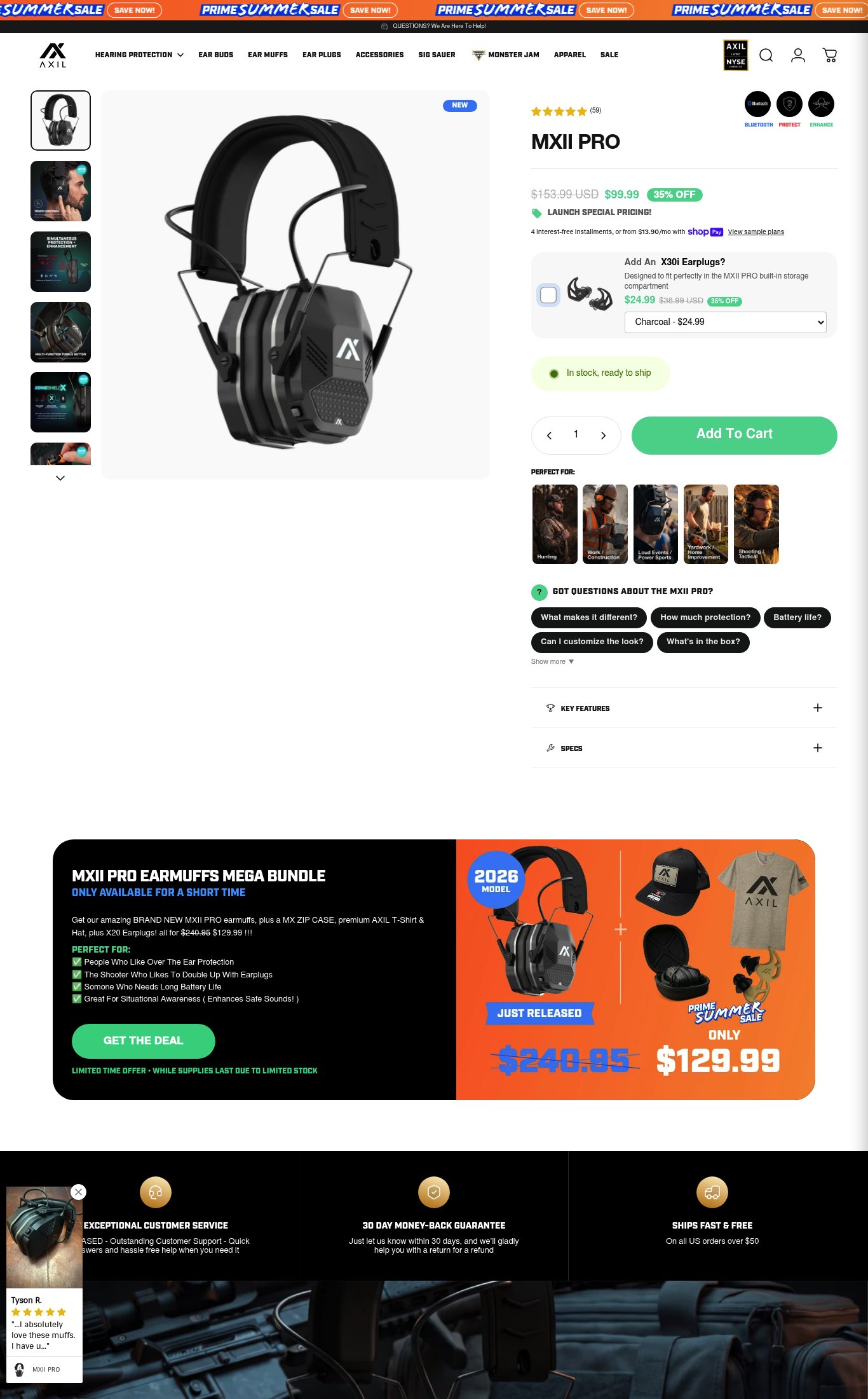
AXIL's MXII PRO page has a solid structural foundation — price, product name, stock status, and a discount are all above the fold on mobile, and the 'PERFECT FOR' use-case tiles help with audience self-selection. The page's strongest dimension is purchase friction setup (guarantee badge, shipping bar, upsell add-on), but the single most critical gap is mobile performance: a PSI score of 41 and a 17-second LCP means a large share of cold mobile visitors bounce before the page renders, making every other optimization irrelevant. Adding a sticky CTA and a benefit-led headline would be the highest-leverage quick wins once load speed is addressed.
Top Finding
The 'Add To Cart' button is green, prominent, and visible above the fold on mobile. The page shows 'In stock, ready to ship' stock status. However, there is no sticky Add to Cart bar observed on mobile scroll — once the user scrolls past the CTA into the FAQ accordions and bundle section, the button disappears and requires scrolling back up.
purchase friction · high
+8 more findings in the full teardown
Get the full teardown
Score breakdown across all 5 dimensions, every finding, prioritized fix list, and category benchmark position.