Anua US
Beautyanua.com
Average
out of 100
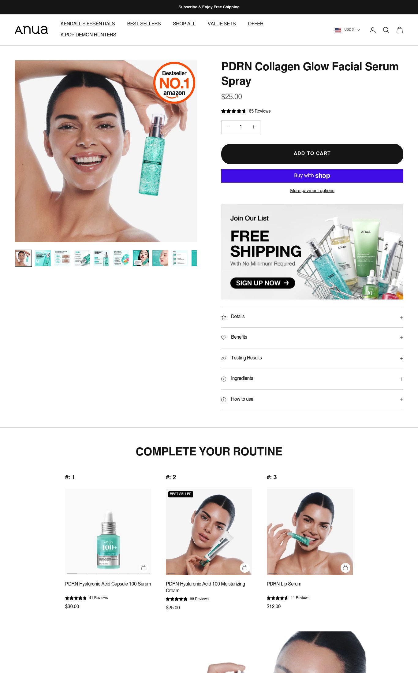
Anua US has a clean, well-structured product page with strong image volume and above-fold social proof placement, making Visual Merchandising its strongest dimension. However, the page is critically undermined by a 24.5-second mobile LCP that will cause most cold visitors to bounce before the page loads, and the absence of a sticky CTA on mobile scroll means users who do engage have no persistent path to purchase. Closing these two gaps — page speed and a sticky buy button — represents the highest-leverage conversion opportunity on this page.
Top Finding
The 'ADD TO CART' button is prominent and dark/high-contrast on mobile, appearing above the fold after the product name and price. However, there is no sticky CTA bar visible on scroll — once the user scrolls past the button into the accordion sections, there is no persistent buy button in the mobile screenshot.
purchase friction · high
+9 more findings in the full teardown
Get the full teardown
Score breakdown across all 5 dimensions, every finding, prioritized fix list, and category benchmark position.