allaura
Home Goodstryallaura.com
Solid
out of 100
Summary
Allaura's linen sheets page is a well-structured, fast-loading product page that nails the fundamentals: clear product name and value proposition above the fold, strong benefit iconography, prominent star rating with 13,000+ reviews, a compelling 30-night guarantee near the CTA, and an excellent PSI score of 94. The brand's strongest dimension is Clarity — the benefit-led copy and pre-order urgency mechanics are genuinely conversion-oriented. The single most critical gap is the absence of video content and customer photo reviews, which are essential for a tactile home goods product where shoppers cannot touch the fabric before buying.
AI-Shoppable
25 / 100 · InvisibleNo Product structured data found — AI shopping agents and answer engines can't reliably read this page's name, price, or availability, so it's unlikely to be surfaced as a recommendation.
Why AI can’t read this page
- Product structured data (JSON-LD). No Product schema — AI agents can't parse the product
- Price in structured data.
- Availability in structured data.
- Ratings in structured data.
- Brand in structured data.
- Image in structured data.
- Description in structured data.
- SKU / GTIN identifier.
- Meta description.
AI shopping assistants and answer engines read a page through its structured data and crawler access. Each item above is a reason this page is harder for them to read, understand, or recommend.
Top Fixes
- 1
Add a product video (15–30 second autoplay loop showing sheet drape, texture, and someone getting into bed) — this is the single highest-impact visual merchandising gap for a tactile product like linen sheets where feel and movement are the core purchase drivers.
- 2
Surface customer photo reviews (UGC) on the product page — with 13,000+ users claimed, there should be abundant photo content; displaying it directly on the page would close the trust gap between the review count and the lack of visual social proof.
- 3
Update the CTA copy from generic 'ADD TO CART' to something pre-order-specific like 'Reserve My Set' or 'Claim Batch 2' to match the scarcity narrative already built into the page and reduce cognitive dissonance between the urgency framing and the generic button.
Findings
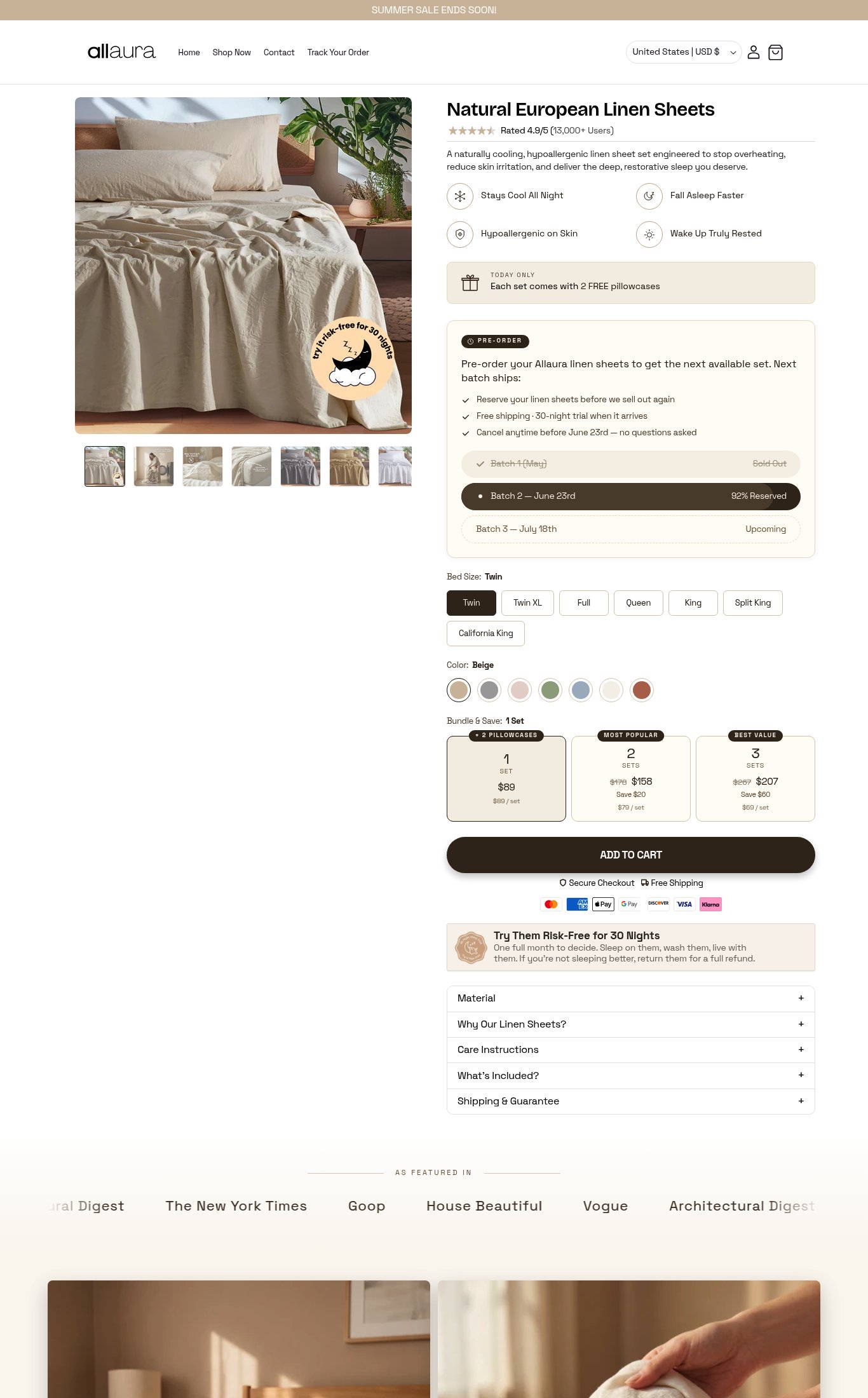
An 'AS FEATURED IN' press bar is visible at the bottom of both screenshots, naming The New York Times, Goop, House Beautiful, Vogue, and Architectural Digest — high-credibility outlets. On mobile, the bar is partially cut off (only 'ural Digest' and 'The New York T' visible in the screenshot), suggesting it may not be fully readable without scrolling. No customer photo reviews or UGC are visible in either screenshot — only a text-based review count is shown. Photo reviews would significantly strengthen trust.
social proof · high
Desktop thumbnail strip shows 7 images; mobile shows at least 6 swipeable thumbnails visible. Image count earns full marks. The hero image is a lifestyle shot of the sheets on a styled bed with plants — strong contextual merchandising. However, no video content (autoplay loop, embedded video, or video thumbnail) is visible on the page in either screenshot.
visual merch · high
CTA copy reads 'ADD TO CART' — functional but generic. Given the pre-order context and scarcity framing ('92% Reserved'), a more specific CTA like 'Reserve My Set' or 'Claim My Batch 2 Set' would reinforce urgency and match the pre-order narrative.
clarity · medium
Mobile images appear full-width and swipe-friendly with no visible clipping or pixelation. The lifestyle hero image communicates texture and color well. A second lifestyle image visible in the desktop bottom section shows a person touching the sheets — good tactile storytelling — but no video is present to demonstrate drape, softness, or real-use context.
visual merch · medium
Product name 'Natural European Linen Sheets' is visible above the fold on mobile, price ($89) is shown in the bundle selector, and the hero description — 'A naturally cooling, hypoallergenic linen sheet set engineered to stop overheating, reduce skin irritation, and deliver the deep, restorative sleep you deserve' — is a strong benefit-led value proposition. Four icon-based benefit callouts (Stays Cool All Night, Fall Asleep Faster, Hypoallergenic on Skin, Wake Up Truly Rested) reinforce the why. Minor gap: the price is not displayed as a standalone prominent figure above the fold — it only appears inside the bundle picker, requiring the user to scan down.
clarity · low
The 'ADD TO CART' button is large, full-width, and dark — visually dominant. On mobile it appears sticky or near-sticky based on placement. The pre-order flow is clearly explained with batch dates, sold-out indicators (Batch 1 crossed out), and a '92% Reserved' urgency label on Batch 2. Bed size and color variant pickers are clearly labeled with the selected state shown ('Bed Size: Twin', 'Color: Beige'). Out-of-stock Batch 1 is visually struck through. No size guide link is visible, which is a minor gap for first-time linen buyers.
purchase friction · low
Shipping clarity is present ('Free Shipping' shown below the CTA button and in the pre-order checklist), and the 30-night risk-free trial guarantee is displayed in a dedicated callout box directly below the CTA — well-positioned. Bundle & Save selector (1 Set / 2 Sets / 3 Sets) with per-set pricing and savings amounts is visible and functions as an on-page upsell. No subscribe & save toggle is present. The pre-order model itself introduces friction — customers must wait until June 23rd minimum — but this is a business model choice, not a page design flaw.
purchase friction · low
Star rating (4.9/5) and review count (13,000+ Users) are displayed directly below the product title on both mobile and desktop — excellent placement near the fold. This is a strong trust signal at the right moment in the purchase journey.
social proof · low
PSI mobile score is 94/100 with LCP 1.4s, FCP 1.4s, CLS 0, and TBT 130ms — excellent across all Core Web Vitals. The page loads fast and is visually stable. Body text is legible at normal viewing distance with adequate contrast. The 'ADD TO CART' button sits in the lower-middle portion of the mobile screen and is reachable in the thumb zone without extreme scrolling.
mobile performance · low
Want this done for your brand?
We score your product page from the outside, cold, on mobile, no install.
Request a teardown →